
Nonprofit brand guidelines are a short, practical document that tells everyone who touches your organisation how it looks, sounds and behaves: staff, volunteers, designers, fundraisers and partners. A good set covers your purpose and positioning, your name and logo rules, colour, type and imagery, your voice, and the Australian compliance details that apply to you. This guide walks through each part, with a focus on accessibility, because for disability organisations the guidelines are also where inclusion becomes a working rule rather than a value statement.
TL;DR
- Brand guidelines are the rulebook that keeps a small team and many hands looking and sounding like one organisation.
- Start with purpose, audiences and positioning. Logo and colour rules only work when they express something real.
- Write accessibility into the guidelines themselves: contrast, alt text, plain language, Easy Read and honest imagery.
- Include the compliance items that are specific to Australia: charity tick use, government funding acknowledgement and name and trade mark checks.
- Keep it short enough to be used. A guide nobody opens does not protect your brand.
Table of Contents
- What brand guidelines are, and why a nonprofit needs them
- What to include in nonprofit brand guidelines
- Brand identity is more than a logo
- Naming a nonprofit
- Accessible visual identity for disability organisations
- Australian compliance items to include
- Putting the guidelines to work
- Perspective: guidelines should make a brand braver
- Need a hand building yours?
- FAQ
- Sources
What brand guidelines are, and why a nonprofit needs them
A brand is the sum of what people expect from you. Guidelines are how you write those expectations down. Without them, a new volunteer picks a font they like, a regional branch stretches the logo, a fundraising appeal sounds nothing like your annual report, and supporters quietly lose track of who is asking them for support.
Nonprofits feel this more than most businesses. Teams are small, turnover is high, work is shared with board members, contractors and community groups, and a lot of material is produced under time pressure. A clear guide means a person can produce a flyer on Tuesday night without asking permission, and it still looks like yours.
Guidelines are not the same as strategy. Strategy decides who you are for and what you stand for. Guidelines record those decisions in a form people can apply. If you have not made the decisions yet, do that first. Our brand messaging framework guide shows how to settle your core message before you design anything.
What to include in nonprofit brand guidelines
There is no single correct table of contents, but most useful guides cover the same ground. Here is the order we recommend, and why.
1. Purpose, audiences and positioning
Open with one page: why you exist, who you serve, who you need support from (donors, funders, referrers, government, members) and what makes you different. Everything after it should be traceable to this page. When someone asks whether a bright orange is “on brand”, the answer comes from your positioning, not personal taste.
List your audiences explicitly. A disability organisation often speaks to people with disability, families, support workers, employers and funders at once, and each needs a slightly different register without the organisation becoming unrecognisable.
2. Name and how to use it
State the full name, the short form, and whether it is written in capitals, title case or lower case. Note any tagline and where it may and may not appear. This sounds trivial until three versions of your name are on three different letterheads.
3. Logo rules
Show the primary logo, the horizontal and stacked versions, the icon or mark on its own, and the one-colour and reversed versions. Set a clear space and a minimum size, and show two or three common mistakes (stretching, recolouring, adding effects). Australia’s Disability Strategy brand guidelines, for example, say to use the full-colour brandmark unless the application does not permit it, which is the kind of plain default-and-exception rule a good guide gives.
4. Colour
Give a primary palette and a secondary palette, each with values for screen and print. Then add the part many guides skip: approved text and background pairings with their contrast ratios, so people do not have to guess whether pale grey on white is legible.
5. Typography
Name a heading font, a body font and a fallback that is available on every computer, such as the system fonts used in Word and Google Docs. Set sizes and line spacing for print and web. If your fonts are licensed, note who holds the licence. The national disability strategy guidelines, again as an example, specify a single typeface for external communications and digital media wherever possible, showing that one decisive choice beats a long menu.
6. Imagery and illustration
Describe the kind of photography, illustration and iconography you use and, just as important, the kind you do not. Include a few annotated examples. We cover the disability-specific side of this below.
7. Voice and tone
Describe how you sound with three or four traits, each with a “we are / we are not” pair, and a few before-and-after sentences. Include your approach to language: for disability organisations, the terms your community prefers and the ones to avoid. If you want a full method, see our guide to writing brand voice guidelines.
8. Applications and templates
Show the brand in use: letterhead, email signature, report cover, social tiles, slide deck, event banner. Provide editable templates where you can. This is the section people will actually open, so make it visual.
9. Compliance and legal items
Cover the Australian specifics: charity tick use, funder acknowledgement and trade mark notes. These are covered in their own section below.
10. Contacts and approvals
Say who owns the brand, who approves exceptions and where the master files live. One named person and one email address is enough.
Brand identity is more than a logo
Readers often search for “nonprofit brand identity” expecting a logo and palette. Identity is wider. It has a verbal side (name, messaging, voice, the stories you tell), a visual side (logo, colour, type, imagery, layout) and a behavioural side: how quickly you reply, how you treat the people you serve, and whether your imagery matches the reality of your programs.
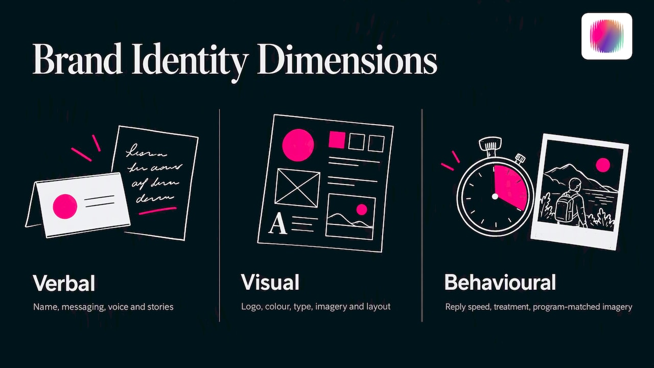
Guidelines should record all three. A beautiful visual system on top of vague messaging produces something attractive that nobody can describe. This is also why a rebrand that only changes the logo rarely changes how people feel about an organisation. If you are weighing that up, our notes on how long a rebrand takes in Australia set realistic expectations.
Naming a nonprofit
If you are naming an organisation or considering a rename, the name is the first line of your guidelines, so it deserves care. A useful method from nonprofit naming advice: list your key audiences, brainstorm neutral, descriptive and hinting names, then test your favourites with people outside your inner circle and choose clarity over cleverness.
The three approaches suit different situations:
| Approach | What it does | Trade-off |
|---|---|---|
| Neutral name | Leaves room for your work to grow or change | Says little until you explain it |
| Descriptive name | Tells people immediately what you do | Can feel limiting if your services expand |
| Hinting name | Suggests a feeling or value without spelling it out | Needs more explanation and careful testing |
For a disability organisation, test the name with the people you serve before anyone else. A name that sounds warm to a board can read as patronising to the community it describes.
Check availability before you commit
Before you register, check the ASIC business names register and IP Australia’s free TM Checker for names and similar trade marks. Registering a business name does not give you exclusive rights to it; a registered trade mark is what gives exclusive rights to use a name on products or services. You will also want a matching web address, and some tools for finding a domain name can speed up the shortlisting, although for an Australian organisation you should confirm the .org.au or .com.au options through the relevant registrar.
Write the result into your guidelines: the official name, any registered trade marks, and the handles you hold on each social platform.
Accessible visual identity for disability organisations
For a disability brand, a visual identity that fails accessibility is not just a design flaw. It contradicts the message. Treat accessibility as a design constraint from the first sketch, not a check at the end. The Australian Government’s Style Manual describes embedding accessibility as a foundation, supported by user research and consistent, responsive design. It is written for government, but the principles carry over to any organisation.
Imagery without stereotypes
The sector is full of the same pictures: a person in a wheelchair at sunset, a hand held in a hand, a smiling child with a carer in soft focus. They are generic, and they tell the audience the organisation has nothing particular to say.
The Style Manual’s guidance on images is a sound baseline. It asks for diverse, clear and relevant images, warns against stock images that seem inauthentic, and says images should be uncluttered and consistent. Your guidelines can turn this into rules:
- Photograph real participants, staff and community members, with consent that covers how the images will be used.
- Show people doing things (working, making, arguing, laughing), not being helped.
- Do not use disability as the visual subject unless the story is about it.
- Credit and pay disabled photographers and illustrators where you can.
- Ban a short list of clichés by name, so the rule is easy to apply.
Colour, contrast and type
Record contrast ratios beside every colour pairing. The Style Manual also says to avoid using colour alone to convey information in graphs and diagrams, so your chart style should use labels, patterns or shapes as well as colour. Set a minimum body size, generous line spacing and left-aligned text, and avoid putting text over busy photography without a solid or gradient overlay.
Alt text and captions
Put alt text in the guidelines as a standing rule: every image gets it, as the Style Manual directs. Include a short example of good alt text for your own content, so it is described by what matters, not just “photo of group”. Do the same for video captions, and make sure video text has strong contrast with its background, as the Style Manual’s video standards require for government content.
Easy Read
Many disability organisations need an Easy Read version of their key documents. Easy Read combines text with layout and imagery to simplify information for people with low literacy, a learning disability or limited English. Give it its own page in your guidelines: the image style, type size, and who reviews versions before they go out. Government content has a legal obligation here under the Disability Discrimination Act 1992, which the Style Manual points out, and non-government organisations serving the same community are wise to meet the same standard.
Your website should meet the same bar. Our website accessibility audit checklist is a quick way to see where you stand.
Australian compliance items to include
This is where generic overseas templates fall short. Add these to your own guide if they apply to you.
The Registered Charity Tick. Only ACNC-registered charities can use the tick, and it must be displayed in line with the ACNC’s style guide. Record where you use it (website footer, annual report, fundraising pages) and who may place it.
Government funding acknowledgement. If you receive Australian Government funding, the funding agreement usually sets out how it must be acknowledged. Older guidance for NGOs from DFAT says due recognition applies to everything and is not optional. Check your own agreement for current requirements, then give funder logos a section: placement, minimum size, who approves.
Names and trade marks. Note any registered trade marks and the correct ways to write them, as covered above.
Putting the guidelines to work
A guide only protects your brand if people use it. A few habits make the difference.
- Keep it short. Ten to twenty pages, or a single web page, beats a hundred-page PDF. Link out to detail.
- Put it where people work. A shared drive link in the onboarding email, plus templates already built in the tools people use.
- Brief new people in 15 minutes. Walk through the five rules that matter most.
- Name an owner and a review cycle. Revisit once a year, or when your services or funders change.
- Roll out in order. Fix the high-visibility items first (website, email signature, social profiles), then replace the rest as it wears out. Our rebrand rollout plan shows how to stop old assets leaking back into circulation.
Social media is where drift happens fastest. If your team posts daily, add platform specifics, such as profile images, highlight covers and caption style. Our Instagram guide for nonprofits covers this for Australian organisations, and our breakdown of social media management costs helps if you are deciding whether to outsource it.
Perspective: guidelines should make a brand braver
We see the same pattern again and again in the disability sector. Organisations come to us with a style guide that is technically complete but says nothing: the same blue, the same stock photography, a mission statement that could belong to any provider. The rules are followed faithfully, and the brand is still invisible.
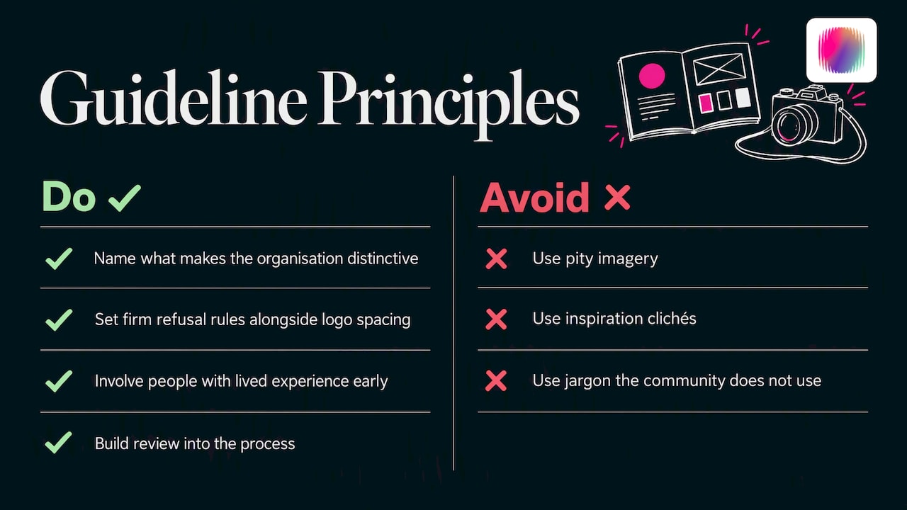
Our view is that guidelines should not just control a brand, they should free it. The best ones say what makes you distinctive, then make it easy for everyone to repeat. That means writing rules about what you will refuse to do (no pity imagery, no inspiration clichés, no jargon the community does not use) as firmly as rules about logo spacing.
It also means involving people with lived experience in building the guide, not asking them to approve it at the end. Our team includes young creatives with disability, and their reading of an image or phrase often catches what an able-bodied committee misses. Write that review step into the process so it survives staff changes.
— Tommy
Need a hand building yours?
If you would rather not build the guide alone, DISBRANDED works with disability organisations, social enterprises and startups on brand strategy, visual identity, web and content, delivered by a team with lived disability experience. See our brand and creative services, or explore our brand guides if you prefer to work through it yourself.
FAQ
What should I include in brand guidelines?
Cover your purpose and audiences, name usage, logo rules, colour, typography, imagery, voice and tone, templates, compliance items and a named owner. Add accessibility rules to each visual section. Keep the whole thing short enough that people will open it.
How long should nonprofit brand guidelines be?
For most small and mid-sized organisations, ten to twenty pages or one well-organised web page is enough. Length is not the goal. If a volunteer cannot find the logo rule in under a minute, the guide is too long or badly organised.
How do I name a nonprofit?
List your audiences, brainstorm neutral, descriptive and hinting options, then test the shortlist with people outside your organisation. Pick clarity over cleverness. Before committing, check the ASIC register and IP Australia’s TM Checker, and remember that a registered business name does not give you exclusive rights.
Does a disability organisation need different brand guidelines?
The structure is the same, but the accessibility and representation rules carry more weight. Include contrast ratios, alt text, Easy Read, an imagery policy that avoids stereotypes, and preferred language. Involve people with lived experience in writing them.
Sources
- Choose a business name, business.gov.au
- How to choose the ideal name for your nonprofit, Kickstarting For Good
- Images, Style Manual
- Design for accessibility and inclusion, Style Manual
- Easy Read, Style Manual
- Requirements and standards for video and audio, Style Manual
- Australia’s Disability Strategy Brand Guidelines
- Terms and conditions of use for the Registered Charity Tick, ACNC
- Visibility and recognition: branding guidelines for NGOs, DFAT
- Domain name tools guide