
A visual identity system is the set of visual elements and written rules that decides how your organisation looks everywhere it appears. It covers your logo, colours, typography, imagery, icons and layout, plus the documentation that tells anyone, from a staff member to an outside designer, how to use them. It sits inside the wider brand identity system, which adds voice, values and personality. This guide explains what goes into the system, how to document it, and how to build one that is distinctive and accessible.
TL;DR
- A visual identity system is a toolkit plus rules: the elements (logo, colour, type, imagery, icons, layout) and the standards for using them.
- The brand identity system is the bigger picture. Visual identity is one part of it, alongside voice, values and personality.
- Written standards are what keep the look consistent when different people, teams and suppliers make new material.
- Build accessibility in from the first sketch: contrast, type hierarchy and alt text are much cheaper to design than to retrofit.
- Start with strategy, then design, then document, then roll out in a planned order.
Table of Contents
- What a visual identity system actually is
- The components of a visual identity system
- Visual identity standards: why you write the rules down
- Accessibility belongs inside the system
- How to build a distinctive visual identity system
- Our perspective
- Getting help with your system
- FAQ
- Sources
What a visual identity system actually is
Most people use “visual identity” and “logo” as if they mean the same thing. They do not. A logo is one asset. A system is the logic that connects every asset. One guide to visual identity describes a modern system as a governance framework: it defines the structure and reasoning behind how a brand appears, so that the look can scale without drifting.
In practical terms, a system answers questions before anyone has to ask them. Which green do we use on a dark background? How much space sits around the logo? What does a photograph of our people look like? Which heading style goes on a report cover, and which on an Instagram tile?
Stripe’s Australian explainer frames visual identity as a business decision, not decoration. It defines it as the visual side of branding that portrays a distinctive, consistent image to customers, expresses personality and values, and sets a business apart from competitors. When it is developed properly, it supports your marketing and feeds your reputation.
Visual identity system vs brand identity system
The two phrases overlap, and readers search for both. The clean way to separate them:
| Visual identity system | Brand identity system | |
|---|---|---|
| Scope | How the brand looks | How the brand looks, sounds and behaves |
| Contains | Logo, colour, type, imagery, icons, layout, usage rules | Everything in the visual system, plus voice, values, personality, messaging |
| Main question | “Does this look like us?” | “Does this feel and read like us?” |
| Typical document | Brand guidelines or visual standards | Full brand guidelines with strategy and voice |
The Frontify guide puts it the same way: visual identity is one key component of the wider, integrated brand identity system. If your look is strong but your writing is generic, the system is only half built. Our guides on brand voice guidelines and a brand messaging framework cover the non-visual half.
The components of a visual identity system
There is no single official list, but Australian public-sector guidelines are a useful benchmark because they are detailed and public. The NSW Government’s visual identity design checklist covers the logo, layout and grid, typography, colours, photography and video, illustration and iconography. That list works for most organisations once you swap the government logo for your own.
1. Logo and its variations
Your logo needs more than one file. A working system usually includes a primary version, a stacked or horizontal alternative, a small-space mark or icon, and one-colour and reversed versions for dark backgrounds. Each variation should have a stated use. A social media avatar, a letterhead and a banner on a building each need a version that holds up at that size.
2. Colour palette
Define a primary palette, a secondary palette and, ideally, a set of neutral tones. Record exact values for print and screen, and note which pairings are approved for text. This is where accessibility and brand meet: a beautiful pairing that fails contrast is not a usable pairing.
3. Typography and hierarchy
Choose typefaces for headings and body text, then set the hierarchy: sizes, weights, line spacing and where each style is used. Include a fallback font for situations where your brand font is not available, such as email or shared documents.
4. Imagery and photography
Say what your photography looks like, who is in it and how they are shown. For a disability organisation this matters enormously. Generic stock imagery is the fastest way to look like everyone else, and it often misrepresents the people you serve. Set rules for authentic, commissioned images, consent and captions.
5. Icons, illustration and graphic elements
Shapes, patterns, line styles and illustration rules give a brand its texture. They are often the difference between a recognisable identity and a logo on a white page. The business.gov.au marketing guidance recommends defining graphic elements alongside your colour palette, fonts and photographic style.
6. Layout, grid and spacing
A grid and spacing rules mean pages feel related even when the content is completely different. Include margins, column structures, logo placement and how much white space to leave.
7. Applications and templates
Show the system working: stationery, presentations, reports, signage, websites and social media. The University of Canberra’s brand guidelines are a good example of this range, covering brand marks, colour, typography, shapes, photography and page architecture, then applying them to publications, signage, websites and social channels.
Branded templates are the most useful application of all. Business.gov.au suggests creating them so your products and social media stay cohesive, and it notes that this cohesion helps build recognition, trust and differentiation.
Visual identity standards: why you write the rules down
A system that lives only in a designer’s head stops working the day that designer is unavailable. Written standards let people who never met the designer produce new material that still looks right. That is the entire purpose of documentation.
Australian public bodies show how specific the rules can get. The Australian Government Branding Guidelines require consistent logo construction and set application rules covering prominence, positioning, one logo per document, no decorative or watermark use, and a minimum isolation zone around the mark. You do not need that level of formality, but the categories are worth borrowing.
There is also a legal and commercial angle. IP Australia advises that organisations define the preferred presentation of a trade mark, set basic rules for colours, fonts, size and placement, check public use for inconsistencies, and keep dated examples such as screenshots, packaging and adverts that show correct use. If you plan to protect your brand, those habits help.
What a useful standards document includes
- Logo rules: versions, minimum size, clear space, and a short list of misuse examples.
- Colour specifications: values for print and screen, approved text and background pairings.
- Type rules: fonts, sizes, hierarchy and fallbacks.
- Imagery guidance: style, subject matter, representation and consent.
- Accessibility requirements: contrast targets, alt text practice, plain-language expectations.
- Templates and file locations: where people find the approved files, and who to ask when something does not fit.
Keep it short enough that people read it. A 12-page guide that gets used beats a 90-page one that does not. For the nonprofit version, see our guide to nonprofit brand guidelines.
Accessibility belongs inside the system
For most organisations accessibility is a compliance step at the end. For a disability-sector brand it is part of the identity itself. If your logo, colours or website exclude people, the message undermines the mission.
Media Access Australia’s brand and logo assessment advises integrating accessibility principles at the start of brand development rather than as an afterthought, so that every asset that follows is accessible by design. That is the cheapest time to get it right.
Practical rules to build in
- Contrast. WCAG Level AA asks for at least a 4.5:1 contrast ratio for normal text, a requirement that Australian Government agencies must meet. The W3C explains the 4.5:1 threshold as allowing for moderately low visual acuity and colour deficiencies. Test every text and background pairing in your palette and record the passing ones.
- Hierarchy. The NSW checklist calls for clear typographic hierarchy, adequate contrast, alt text for photos and illustrations, and WCAG AA digital content. Build these into your type and image rules.
- Colour is never the only signal. Pair colour with a label, icon or pattern so meaning survives for people with colour vision differences.
- Legal context. NSW agencies must provide information in a non-discriminatory, accessible manner under the Disability Discrimination Act 1992, according to the same checklist. Private organisations should check their own obligations, but the direction is clear.
For the digital side, our WCAG 2.2 checklist for Australian organisations and website accessibility audit checklist turn these principles into tasks, and a published accessibility statement shows your audience that you take it seriously.
How to build a distinctive visual identity system
A visual identity that looks like every other organisation in your sector is a missed opportunity. Distinctiveness comes from strategy first and design second. Here is the order we recommend.
Step 1: Get the strategy straight
Before choosing a colour, write down who you serve, what you stand for, who you are competing with for attention, and what you want people to feel. Without this, design becomes a taste contest.
Step 2: Audit what you have
Collect everything your organisation currently puts out: website, reports, social posts, signage, email signatures. Business.gov.au recommends reviewing your products and social media to see whether they look cohesive and professional. Note what is inconsistent and what people already recognise and value.
Step 3: Design the core elements
Develop the logo, palette, typography, imagery direction and graphic elements together, not one after another. They need to work as a set. Test them in real applications early: a tiny avatar, a dense report page, a mobile screen.
Step 4: Test for accessibility and use
Check contrast, legibility at small sizes, and how the system behaves for screen reader users and people with low vision. Ask people with lived disability experience to review it, not only an accessibility tool.
Step 5: Document the standards
Write the guidelines, build the templates and organise the files. Put the rules where people work, not in a PDF nobody can find.
Step 6: Roll out in a planned order
Change the highest-visibility items first, then work down. Plan for the places that get missed: old email signatures, third-party listings, printed stock, social profiles. Our rebrand rollout plan covers where rollouts usually leak, our rebrand timeline sets realistic expectations, and the nonprofit rebranding guide covers decisions specific to community organisations.
Step 7: Maintain it
Check public use of the brand regularly, as IP Australia suggests for trade marks. Keep dated examples of correct use, update templates when needs change, and appoint one person who owns the system.
Our perspective
We work with disability organisations, startups and social enterprises, and the same problem turns up again and again: the sector looks the same. The same stock photos, the same hands-and-hearts logos, the same soft blue. When every brand looks alike, none of them is remembered, and the people those brands exist for are flattened into a stereotype.
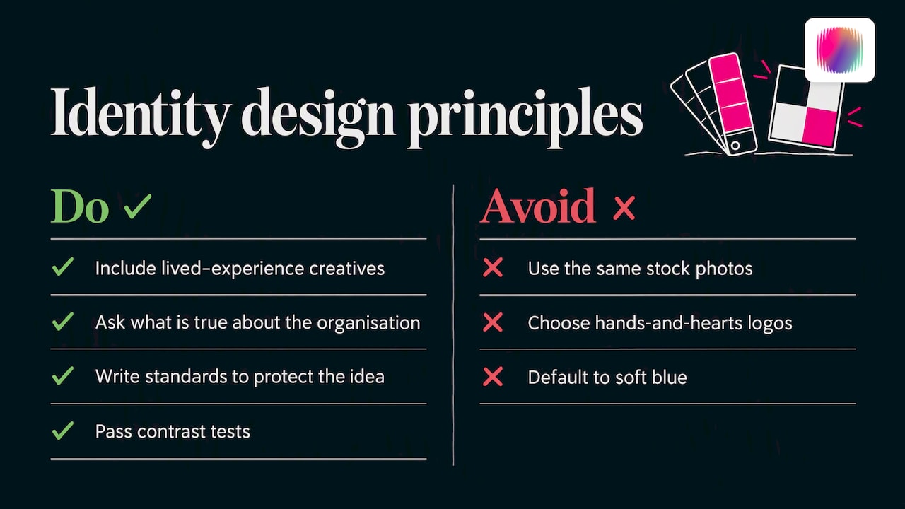
A visual identity system is the antidote, but only if it starts from something real. Our team includes young creatives with lived disability experience, and that changes how we ask questions. We do not ask “what do disability brands usually look like?” We ask what is true about this organisation, and what it would look like if the people it serves had designed it. Then we write standards that protect that idea, so it survives a new hire, a new agency or a rushed Friday deadline.
Our view is simple. Accessibility is not a constraint on a bold identity; it is part of what makes it bold. A palette that passes contrast tests and still feels alive is harder to design than one that does not, and it is worth the effort.
— Tommy
Getting help with your system
Some organisations can build a system in house, particularly with templates and a clear brief. Others need a partner to get the strategy and design right, then hand over documentation the team can actually use.
We provide brand strategy, brand design, creative assets, web design, social media and DIY brand-building courses for disability organisations and social enterprises. If you want a system built with people who understand the sector, see our services.
If you would rather start on your own, our brand guides and course assignments give you a structured path through the same process we use with clients.
FAQ
What is the difference between a visual identity and a visual identity system?
Visual identity is the collection of visual elements that represent your brand, such as the logo, colours and fonts. A visual identity system adds the structure: the rules, hierarchy, templates and documentation that explain how those elements work together. The system is what makes the identity consistent when many people use it.
What are the main components of a visual identity system?
The core components are the logo and its variations, a colour palette, typography and hierarchy, photography and imagery guidelines, icons and illustration, and layout rules such as grids and spacing. Public guidelines like the NSW Government checklist list these same elements. Most organisations add templates and application examples so the rules are easy to follow.
Is a brand identity system the same thing?
Not quite. A brand identity system is the wider framework, covering voice, values and personality as well as the visual look. The visual identity system is one component of it. Many people search for both terms, and in practice you will usually want to define the two together.
How long should visual identity standards be?
Long enough to answer the questions people actually ask, and short enough to be read. For a small or mid-sized organisation, a concise guide covering logo, colour, type, imagery, accessibility and templates is usually enough. Government documents are far longer because they serve many agencies, so borrow their categories rather than their length.
How do I make my visual identity accessible?
Start accessibility at the beginning of the design process. Test every text and background colour pairing against the WCAG AA contrast ratio of 4.5:1 for normal text, set a clear type hierarchy, never rely on colour alone, and write alt text rules for imagery. Involving people with lived disability experience in review will catch what tools miss.
Sources
- What is a visual identity? Key elements, systems, and more (Frontify)
- What is a visual identity for a brand? (Stripe Australia)
- NSW Government Visual Identity System: Design Checklist
- Improve your marketing in 60 minutes or less (business.gov.au)
- University of Canberra Brand Guidelines
- Australian Government Branding Guidelines
- Use your trade mark prominently (IP Australia)
- Brand and Logo Assessment (Media Access Australia)
- Official departmental style guides and brand guides (DEWR)
- Understanding SC 1.4.3 Contrast (Minimum) (W3C)