Good website structure is invisible. When it’s working, visitors find what they need effortlessly. When it’s broken, they bounce.
The Sitemap
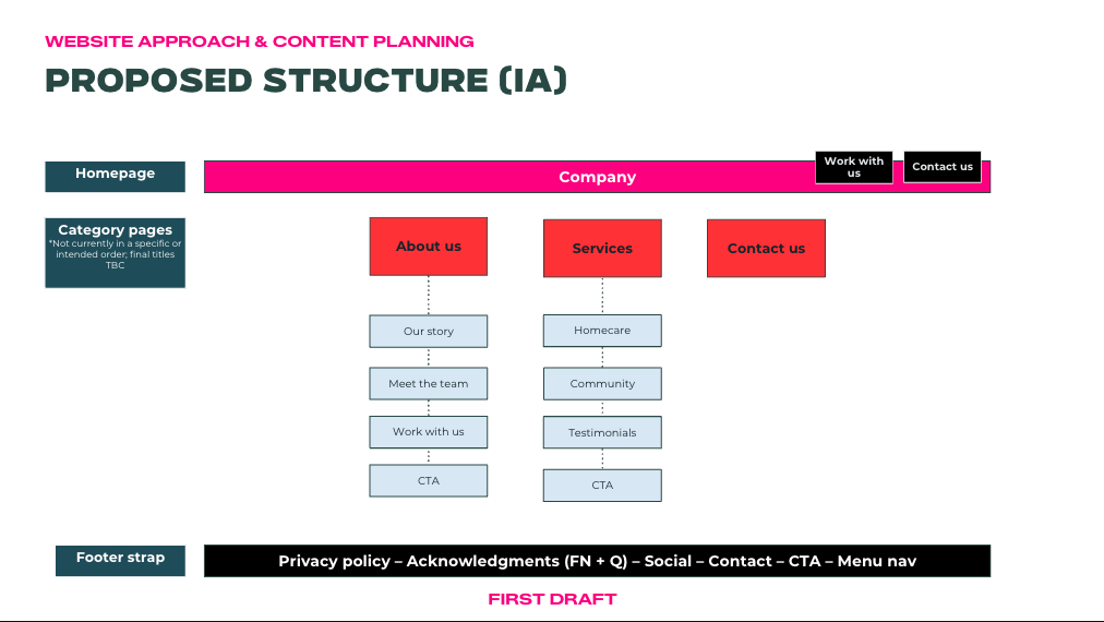
Is the websites layout, essentially done the same way an org structure chart is. You have home up the top, and then all the seperate pages flowing from that.
The essential pages
Homepage: The shop-front. Must orient visitors immediately and point them toward the right next step.
Services page(s): What you offer, specifically. Don’t be vague. Name the supports, specify the locations, explain the eligibility.
About page: Who you are and why you do this. This is where your brand story and principles live. Make it human and compelling.
Contact page: Make it easy. Include a form, a phone number, an email address, and your physical location if relevant. The more options, the better.
(SIL ONLY) Vacancies page: For SIL providers especially, a current vacancies page is often the highest-converting page on the site. Keep it updated.
Navigation principles
Site navigation refers to the pages, how the site is structured, what goes where and how do I get from one page to another. Everything should be intuitive, information placed where it should logically go and easy to find.
- Keep your main navigation to 5-7 items maximum
- Put the most important pages first
- Always include a contact/enquire button in the navigation header/footer
- Avoid dropdown mega-menus if you can
The user journey
Refers to the experience the first time visitor has on your site. Think about how different visitors navigate your site:
A participant’s family might land on your homepage, check your services, look at your about page, and then either call or fill in a form.
A support coordinator might go straight to your services page, check locations and eligibility, then look for a referral form.
A potential staff member might go to your about page, then careers.
Each of these journeys should be frictionless. Map them out and make sure each one ends at a clear action.
Build each page as a stack of sections
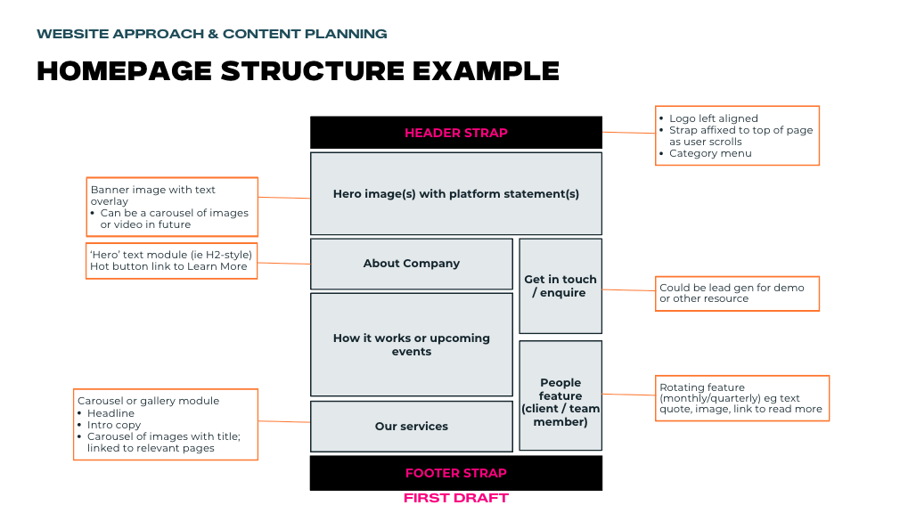
Here’s a practical way to think about building any page: don’t picture a blank canvas, picture a vertical stack of blocks, each doing one job, in a deliberate order. This is how modern website builders actually work, and it’s how you go from ‘I don’t know where to start’ to a clear plan.
A simple homepage stack, top to bottom:
- Hero: headline, one supporting line, one primary button
- What we do: your core services at a glance
- Why us / trust: a testimonial, outcomes, or recognitions
- How it works: the simple steps to get started
- Call to action: a second clear invitation to enquire
- Footer: contact, service areas, key links
Before you build or brief anyone, sketch each page as this kind of stack, even rough boxes on paper with a label in each. That rough sketch is called a wireframe, and it’s the single most useful planning step. It lets you sort out what goes where before worrying about colours, photos, or fonts. We go through each core page’s stack in detail in the next lesson, the page-by-page playbook.
Two patterns worth getting right
Service areas. In the disability sector, ‘where do you operate?’ is one of the first things people need to know, a service three suburbs away may be no use to them. Make your service areas obvious: state them on the homepage and your google business profile, list them clearly on your services or contact page, and weave the location names into your copy (which also helps you get found in local searches). Don’t make people guess whether you cover them.
Vacancies and availability. For SIL and accommodation providers especially, a clear, current vacancies page is often the highest-converting page on the whole site because someone looking at vacancies is ready to act now. Keep it genuinely up to date, make each vacancy specific (location, who it suits, what’s on offer), and put an enquiry button right there on the vacancy. An out-of-date vacancies page does the opposite: it erodes trust at the exact moment someone was ready to enquire.
Mobile first
More than 60% of web traffic is on mobile. Design for mobile first, desktop second. If your website is hard to use on a phone, you’re losing more than half your potential enquiries.
Designing mobile-first also disciplines your structure: on a narrow screen your section stack simply appears one block after another, top to bottom, so getting that order right (most important first) is exactly what makes the mobile experience work.
Exercise
Sketch out your ideal website structure. What pages do you need? What’s the logical order? What’s the most important action on each page?
Then take your homepage and draw it as a wireframe a stack of labelled boxes in order, top to bottom. Don’t worry about how it looks yet. Just get the sections and their order right. That sketch is what you’ll build (or brief someone to build) from.