
Email accessibility means building every email so people can read, understand and act on it whatever their vision, hearing, motor or cognitive needs, and whatever device or assistive technology they use. In practice that comes down to clear writing, real headings, descriptive links, meaningful alt text, strong contrast, semantic HTML and testing with more than your own eyes. This guide covers each of those, the Australian expectations behind them, and a checklist to run before you hit send.
TL;DR
- Australian guidance lists email among the digital services that should meet accessibility standards, and the Australian Human Rights Commission points organisations to WCAG 2.2 Level AA.
- Most fixes are simple: left-aligned plain language, 4.5:1 text contrast, real headings, descriptive link text, short alt text and buttons that are easy to tap.
- Build in semantic HTML, set the language, mark layout tables as presentation and offer a plain-text version where practical.
- Test in the major email clients, with a keyboard, with a screen reader and in dark mode before each send.
- Treat accessibility as part of your brand, not a late patch: it is cheaper and it shows who you are.
Table of Contents
- Why email accessibility matters
- What Australian guidance expects
- Write and structure content that reads clearly
- Links, buttons and calls to action
- Images, alt text and live text
- Colour, contrast and typography
- Building accessible HTML emails
- Dark mode, zoom and different devices
- How to test email accessibility
- A pre-send email accessibility checklist
- Make accessible email part of your template system
- Get your emails and brand working together
- FAQ
- Sources
Why email accessibility matters
Email is one of the few channels almost every audience uses, which makes its barriers expensive. Litmus reports that one in four adults in the US and EU has a disability, rising to one in six worldwide, and cites the WHO figure of at least 2.2 billion people with near or distance vision impairment. Your subscriber list will include people in those groups, whether or not they have told you.
The Australian Human Rights Commission’s 2025 digital accessibility guidelines describe how barriers such as missing alternative text or poorly titled links often come from ableist assumptions in design decisions. The result is exclusion, loss of independence and reduced participation. An email with an unlabelled image button is a small example of exactly that.
There is also a plain business case. RMIT University’s Digital Accessibility Procedure says accessibility improves everyone’s experience and avoids costly remediation. Think of a commuter reading on a phone in bright sun, or someone skimming with one hand. Clear contrast, large tap targets and plain language help them too.
Lauren Castady, a design leader and accessibility advocate, put it well when quoted by Litmus: accessibility is often framed as designing for an edge case, when it is one of the largest audiences we design for.
What Australian guidance expects
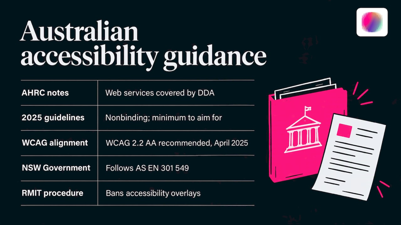
The legal picture is worth understanding without panic. The Australian Human Rights Commission’s Advisory Notes state that providing information and services over the web is a service covered by the Disability Discrimination Act (DDA), with equal access required where it can reasonably be provided.
The 2025 AHRC guidelines are issued under the DDA and AHRC Act but are not legally binding. They are, however, described as the minimum organisations should aim for to meet their DDA obligations. In April 2025 the Commission recommended alignment with WCAG 2.2 Level AA, and a Deque summary of the guidelines notes emails are listed among the digital services in scope, alongside websites, apps, online forms, PDFs, videos and social media posts.
Government and universities show what good looks like. The NSW Government states that all digital products and services must be accessible under the DDA and follows the Australian ICT procurement standard AS EN 301 549. RMIT’s procedure explicitly covers email and other online communication channels and bans accessibility overlays that promise to fix issues automatically. That last point matters for email too: no plug-in will rescue a poorly built template.
If you are mapping the full standard, our WCAG 2.2 checklist for Australian organisations breaks the success criteria into practical checks. The email principles below are the same ideas applied to a tighter, less predictable medium.
Write and structure content that reads clearly
Accessibility starts with words, before any code. The NSW Email Toolkit calls for plain language, consistent layouts and left-aligned paragraphs. Fully justified or centred paragraphs create uneven spacing and tiring line starts, particularly for readers with dyslexia.
Subject lines and opening lines
The subject line and the first sentence are what a screen reader user hears first. Make them say what the email is and what you want. Keep emoji to a minimum, since each one is read aloud as its full description, and never let one carry meaning alone.
Headings and reading order
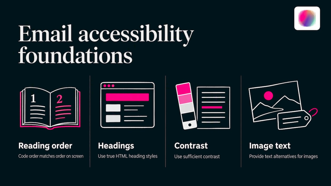
Media Access Australia says a basic accessible email needs a logical reading order, true HTML heading styles rather than just bold text, sufficient contrast and text alternatives for images. Headings let screen reader users jump through an email the way sighted readers skim. Use one top-level heading, then subheadings in order, and make sure the order in the code matches the order on screen.
Short sections, one job per email
Cut long blocks into short paragraphs and lists. Use one main call to action per email. People with cognitive disability, attention differences or just a busy morning will thank you. Our guide to neuroinclusive design goes deeper on reducing load for different thinkers.
Links, buttons and calls to action
Links are where emails most often fail. Screen reader users can pull up a list of all links in a message, so “click here” or “read more” repeated five times is meaningless out of context. Write link text that names the destination: “Download the 2026 annual report” rather than “Download”.
For buttons, the NSW guidance asks for clear button labels and touch targets of at least 44 × 44 px. Give buttons real padding, leave space between them, and don’t rely on colour alone to make a link look like a link: underline links in body text.
If you use image-based buttons because of Outlook limitations, make sure the alt text carries the button’s action. Better still, use a bulletproof text button with a background colour so the label stays live text.
Images, alt text and live text
Keep key content as live text. Text baked into an image disappears when images are blocked, which is the default in many clients, and it cannot be resized or read aloud. Headline offers, dates and prices belong in text.
For alt text, the University of Sussex guidance says it should describe what is happening in the image, stay short and meaningful (no more than 26 words), and that purely decorative images should use an empty alt attribute (alt=""). Describe the purpose, not the pixels. A photo of a team at a workshop might read “Three facilitators leading a branding workshop”, while a divider line gets an empty alt.
Complex graphics need extra care: summarise the key finding in the body text. Our guide to accessible infographics shows how to pair a visual with a text version that carries the same information.
Colour, contrast and typography
The NSW Email Toolkit specifies WCAG AA minimum contrast of 4.5:1 for normal text and 3:1 for large text, with large meaning at least 18.66 px regular or 14 px bold. It also requires that colour never be the only way meaning is conveyed. A red “error” or green “success” needs a label or icon with text alongside.
The same guidance gives sensible type settings:
| Element | Recommendation |
|---|---|
| Body text on desktop | 14 to 16 px |
| Body text on mobile | At least 16 px |
| Line height | 1.5 to 1.6 |
| Alignment | Left-aligned paragraphs |
| Normal text contrast | 4.5:1 minimum |
| Large text contrast | 3:1 minimum |
| Touch targets | 44 × 44 px |
Brand palettes are where these numbers bite. A pale accent colour that looks lovely on a website header often fails as text on white. Check each pairing once, then lock approved combinations into your template or brand guide so nobody needs to guess. Our visual identity checklist includes contrast as one of its sign-off checks.
Building accessible HTML emails
HTML email is its own beast. The NSW toolkit’s development best practices note that Outlook for Windows desktop renders with Microsoft Word’s engine, needs table-based layouts and inline CSS, and lacks flexbox, grid and some CSS shorthand. Gmail’s web client, by contrast, supports most CSS properties and media queries. You are building for the least capable client, then enhancing.
Within those limits, the core accessible habits are:
- Use semantic elements. Real h1, h2 and p tags communicate structure and meaning, as the NSW designer guidance asks. Don’t fake headings with large bold spans.
- Declare the language. Setting
lang="en"on the html element lets screen readers choose the right pronunciation, a point also made in eNudge’s email accessibility guide. - Mark layout tables as presentation. Add
role="presentation"to tables used for layout so screen readers skip the table markup and read the content in order. The same eNudge guide suggests marking buttons with a button role so they are announced as interactive. - Go single-column and mobile-first. A simple stacked layout keeps reading order predictable and zooms cleanly.
- Title the document. Add a meaningful title element and a sensible preheader.
- Offer a plain-text version where practical. The NSW toolkit recommends it as part of building a robust email.
Keep the code lean. Every nested table is another layer a screen reader may announce, so avoid unnecessary nesting.
Dark mode, zoom and different devices
Dark mode can invert colours automatically and quietly break contrast. The NSW guidance recommends dark-mode-friendly colour tokens, testing contrast in both light and dark modes and avoiding colour-only distinctions. Logos with dark text on a transparent background are a classic failure: they vanish on a dark canvas. Add a light outline or supply a version that works on both.
Also check that the email holds up when text is enlarged. People who zoom to 200 per cent or raise system font sizes should not lose content or need to scroll sideways in a single-column layout.
How to test email accessibility
Automated checkers catch only some problems, so combine tools with human testing. A workable routine looks like this.
Step 1: Preview across clients
The NSW toolkit advises testing at minimum in Outlook desktop, Gmail on web and mobile, Apple Mail on macOS and iOS, Outlook.com and Yahoo Mail, using a preview tool for full coverage. Look for broken layouts, blocked-image states and colour shifts.
Step 2: Keyboard test
A keyboard test, as described by Campaign Monitor, goes like this: open the email in a desktop client, set the mouse aside, and tab through every interactive element. Check the order is logical and that a visible focus indicator shows where you are. Activate links with Enter or Spacebar, then repeat in a webmail client.
Step 3: Screen reader test
The NSW guidance says to test with screen readers and other assistive technologies. Listen to the email from subject line to footer. Does the order make sense? Are images described usefully? Do links make sense when read alone? Even 10 minutes with a built-in screen reader will reveal issues no checker flags.
Step 4: Map issues to WCAG
Campaign Monitor’s guide maps email tests to WCAG success criteria, including reading order, alt text, headings and lists, and zoom. That mapping, published against WCAG 2.0, is a handy way to explain fixes to stakeholders. Where you report formally, use WCAG 2.2 AA as the target, in line with the AHRC.
Step 5: Involve people with disability
RMIT’s procedure says compliance should be complemented by a human-centred approach that includes the perspectives of people with disability. Our guide to inclusive UX research shows how to recruit and pay participants well and run sessions that respect their time.
A pre-send email accessibility checklist
Pin this next to your email platform. It pulls together the guidance above into checks you can finish in a few minutes per campaign.
Content
- The subject line and first sentence say what the email is and what to do.
- Language is plain, with short paragraphs and one main call to action.
- Paragraphs are left-aligned, not justified or centred.
- Emoji are rare and never carry meaning alone.
Structure
- Headings are real heading elements in a logical order.
- Reading order in the code matches the visual order.
- Layout is a single column and survives zoom.
- The language attribute is set and layout tables are marked as presentation.
Links and buttons
- Every link makes sense out of context.
- Buttons have clear labels and 44 × 44 px touch targets.
- Links in body text are underlined, not only coloured.
Images and colour
- Every meaningful image has short alt text, and decorative images use empty alt.
- Key information is live text, not part of an image.
- Text meets 4.5:1 contrast (3:1 for large text) in light and dark modes.
- Colour is never the only signal.
Testing
- Previewed in Outlook desktop, Gmail, Apple Mail, Outlook.com and Yahoo Mail.
- Tabbed through with a keyboard and heard in a screen reader.
- A plain-text version is included where practical.
Teams that send events or fundraising invitations can pair this list with an accessible events checklist, since planning access early avoids costly retrofits in the invitation and the event itself. If you are building in-house skills in campaign work, a structured email marketing expert course can give your team a shared foundation to add these accessibility habits onto.
Make accessible email part of your template system
Checklists work best when they only need to be followed once. Build an accessible master template with approved colour pairings, heading styles, button components and footer, then lock it. Writers then only fill in content, and the structure takes care of itself.
Document decisions in a short email section of your brand guide: type sizes, contrast-checked colours, alt text conventions and tone of voice. If your site carries an accessibility commitment, mirror it in your emails and make sure it is stated honestly. Our guide to what an accessibility statement should include is a good model, and a website accessibility audit checklist helps keep the landing pages your emails link to at the same standard. An accessible email that lands on an inaccessible form still fails the reader.
Our view: accessibility is a brand decision
We have spent more than 20 years helping disability brands move past generic imagery and messaging, and our team includes young creatives with lived disability experience. That shapes how we look at email. An inbox is one of the most personal places a brand appears, and it is where a generic, hard-to-read message does the most damage to trust.
We don’t see accessibility as a compliance layer added at the end. We see it as a design constraint that makes the identity sharper: a palette chosen for contrast, type that reads at any size, copy that sounds like a person. For organisations serving or led by people with disability, an email that fails the audience it is meant for sends the wrong message before anyone reads a word.
Our approach is to settle voice, visual identity and templates together, so the accessible version of your email is simply the way your brand looks and sounds. That is where strategy, design and lived experience meet.
Tommy
Get your emails and brand working together
If your email templates, colours and tone were never designed with accessibility in mind, it is usually faster to fix them at the identity level than campaign by campaign. We help disability organisations, social enterprises, startups and established businesses build brand strategy, visual identity, web design, content and social media that reads clearly and looks like nobody else.
See how we work on our services page, or start with our brand messaging framework to get your voice right before you design the template.
FAQ
Are Australian organisations legally required to make emails accessible?
The DDA covers the provision of information and services, and the AHRC’s 2025 guidelines list email among the digital services in scope. The guidelines themselves are not legally binding, but they set the minimum an organisation should aim for to meet its DDA obligations. For advice on your own situation, speak with a lawyer experienced in disability discrimination law.
Which WCAG level should emails aim for?
The Australian Human Rights Commission recommends alignment with WCAG 2.2 Level AA. Practically, that means 4.5:1 contrast for normal text, text alternatives for images, a logical reading order, meaningful link text and no reliance on colour alone. Aim for these in every template.
What is the minimum font size for accessible emails?
The NSW Email Toolkit suggests 14 to 16 px body text on desktop and at least 16 px on mobile, with a line height of 1.5 to 1.6. Pair that with left-aligned text and a single-column layout. Readers can still zoom, so make sure nothing breaks when they do.
How long should alt text be?
Keep it short and meaningful. The University of Sussex guidance puts the ceiling at 26 words and says to describe what is happening in the image. Decorative images should have an empty alt attribute so screen readers skip them.
Do I need a plain-text version of every email?
The NSW Email Toolkit recommends offering a plain-text version where practical, as part of building a robust email. It gives readers whose clients or assistive technologies handle HTML poorly a reliable alternative. Most email platforms can generate one, so check it reads in a sensible order.
Sources
- The Ultimate Guide to Email Accessibility in 2026, Litmus
- Digital accessibility guidelines for disability 2025, Australian Human Rights Commission
- Digital Accessibility Procedure, RMIT University
- World Wide Web Access: Disability Discrimination Act Advisory Notes
- Australia’s accessibility laws, Deque
- The 2025 AHRC accessibility guidelines, Deque
- Accessible technology, NSW Government
- Accessibility, NSW Email Toolkit
- HTML email development best practices, NSW Email Toolkit
- Accessible Email Marketing, Media Access Australia
- Creating accessible emails, University of Sussex
- Guide to Accessibility in Email Marketing, eNudge
- Accessibility & Email Campaigns, Campaign Monitor
- Accessible Events Checklist Australia
- Email Marketing Expert course