
Dyslexia-friendly design means building text so that people who read differently can get through it with less effort. In practice that comes down to a familiar sans-serif typeface at a generous size, left-aligned text with roomy spacing, plain backgrounds, strong contrast, clear headings and a website that meets WCAG 2.2 Level AA. There is no single magic font. The layout around the letters matters more than the typeface name, and testing with dyslexic readers beats any rulebook.
This guide is for Australian organisations, social enterprises and brands that publish information and want it to work for everyone. It covers fonts, size and spacing, colour, websites, the standards that apply here and how to test your work.
TL;DR
- Choose a familiar, clearly shaped sans-serif font (Arial, Verdana, Lexend, Atkinson Hyperlegible and similar), and keep to one or two typefaces.
- Set body text at 12 to 14 points in print and at least 16 pixels on screen, with about 1.5 line spacing, left alignment and short paragraphs.
- Use plain backgrounds, meet at least a 4.5:1 contrast ratio, and never rely on colour alone to carry meaning.
- For websites, work to WCAG 2.2 Level AA, build real heading structure, and let readers resize text.
- Treat guidance as a starting point: test with dyslexic readers and adjust.
Table of Contents
- What dyslexia-friendly design actually means
- Choosing a font: what the guidance says
- Size, spacing and alignment
- Colour, contrast and backgrounds
- Making a website dyslexia-friendly
- Australian standards and what they ask of you
- Checking your work before it goes live
- Putting it into your brand system
- Work with a team that designs for access
- FAQ
- Sources
What dyslexia-friendly design actually means
Dyslexia affects how people process written language, so the aim of the design is to reduce the visual and cognitive work of decoding text. It is not a special “dyslexic” look. The same choices that help dyslexic readers tend to help tired readers, people reading on a phone, people with low vision and people reading in a second language.
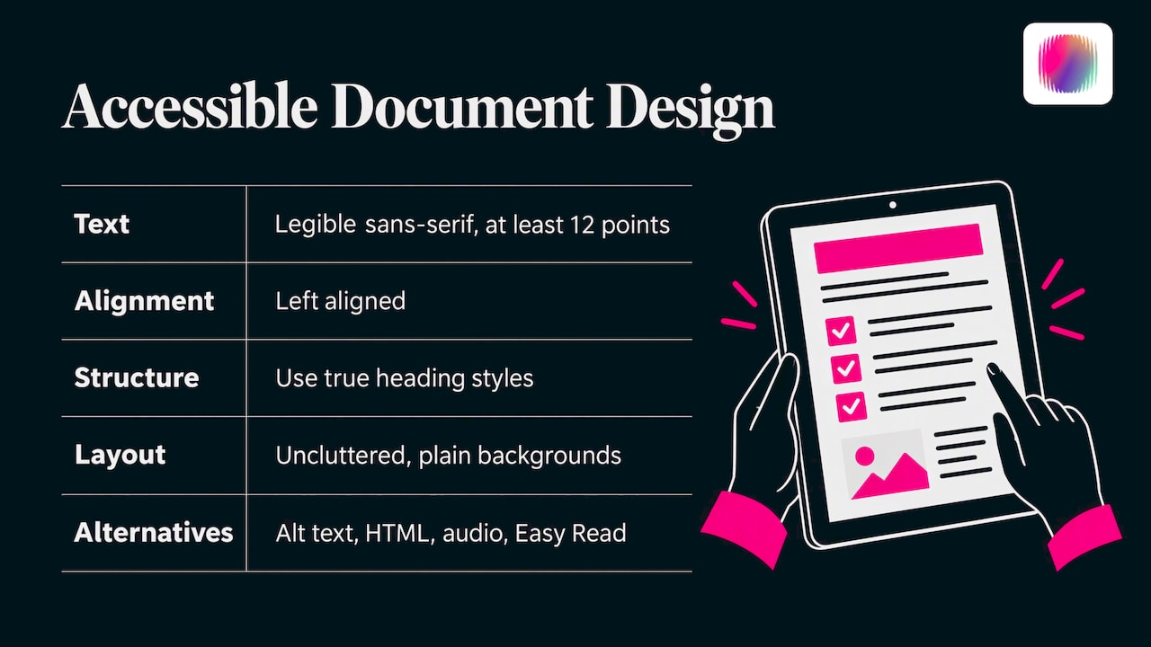
Australian government guidance for accessible documents lists the core moves: plain, legible sans-serif text of at least 12 points, left alignment, true heading styles, uncluttered layouts, plain backgrounds, alt text and alternative formats such as HTML, audio or Easy Read. Notice how little of that is about the font itself. Structure, space and alternatives do most of the work.
If you want the wider picture, dyslexia sits within a family of differences in how people take in information. Our guide to neuroinclusive design covers how to apply the same thinking across ADHD, autism and dyslexia in your brand.
Choosing a font: what the guidance says
Most people searching for dyslexia-friendly fonts want a name to pick. The honest answer is that a short list of readable options exists, but no font is universally best.
Familiar sans-serif fonts are the safe default
NSW government guidance recommends sans-serif fonts because they can make letter shapes clearer, and advises avoiding excessive bold, italics, underlining, capitals and justified text.
The National Association for the Visual Arts (NAVA) goes further for Australian practitioners. Its accessibility guidelines ask for clear distinctions between similar characters such as I, l and 1, O and 0, and b and d. They list Arial, Atkinson Hyperlegible, APHont, Inter, Lexend, Open Sans and Source Sans as possible readable choices.
A quick test for any candidate font: type “Il1 O0 bdpq rn m” and look at it at body size. If characters blur into one another, or mirror-image letters look too alike, choose another.
What to avoid
The same NAVA document warns against decorative, script, ultra-light, condensed and italic-only body type. It also recommends minimising typeface changes and turning off automatic ligatures in digital or PDF text, because joined letterforms can be read incorrectly by assistive technologies. In a brand context this matters: a beautiful display font can stay in your logo and large headlines, while body copy gets a workhorse.
What about OpenDyslexic and Dyslexie?
These fonts were made specifically for dyslexic readers and are well known. A document from Australian Dyslexia Support Services reports that Macquarie University research found people with reading difficulties read 7.5% faster using OpenDyslexic or Dyslexie, and presents them as options to trial rather than a requirement. Other guidance takes a broader view: ta11y notes that familiar fonts, adequate spacing and appropriate size matter, and that sans-serif is not always better than serif.
The practical conclusion is to design with a readable default and give readers control. Let people enlarge text and change font style and size on the web, and offer a plain alternative format when you can.
Size, spacing and alignment
Typeface gets the attention, but spacing is where most documents fail. Several Australian and international sources agree closely.
| Element | Screen | Source | |
|---|---|---|---|
| Body text size | 12 pt standard, 14 pt where older or low-vision readers are likely | 16 px minimum, 18 px preferred for long reading | NAVA |
| Body text, dyslexia-specific | 12 to 14 pt | About 16 to 19 px | British Dyslexia Association |
| Easy Read text | At least 14 pt | Same principles | Style Manual |
| Line spacing | About 1.5 | About 1.5 | British Dyslexia Association |
| Alignment | Left | Left | All of the above |
A few details worth building into your templates:
- Line length. NAVA suggests 40 to 80 characters per line. Long lines make it easy to lose your place when moving to the next one.
- Paragraph spacing. Vision Australia generally recommends line spacing of about 1.5 times the text size and paragraph spacing of about twice the text size. It also advises using dedicated spacing controls rather than repeated blank lines, which can confuse screen-reader users.
- Margins and white space. The Style Manual’s Easy Read guidance calls for wide margins, plenty of white space and no paragraphs or sentences split across pages.
- Emphasis. Use bold sparingly for key words. Avoid continuous capitals, italics and underlining for whole passages, as the British Dyslexia Association style guide advises.
- Headings. Make them larger and visually stronger than body text. On the web, Vision Australia recommends sizing headings with relative units such as em or rem so they scale when readers change their settings.
Writing matters here as much as typography. The BDA recommends short sentences and short paragraphs. If you are building a house style, our brand voice guidelines guide shows how to write plain, consistent copy that supports this.
Colour, contrast and backgrounds
Colour advice for dyslexia is where one-size-fits-all claims are most common. Some readers prefer a cream or pastel background; others find it makes no difference. The firm, checkable rules are about contrast and plain backgrounds.
- Contrast ratio. NSW guidance specifies at least 4.5:1 for ordinary text and 3:1 for large text, where large means at least 18-point unbolded or 14-point bold.
- Plain backgrounds. The Australian Government’s accessible materials guidance recommends backgrounds without images, graphics, print or watermarks, and printing on plain matte or satin-finish, non-reflective paper.
- Colour is never the only signal. NSW guidance notes that screen readers do not communicate colour changes, so add text, a shape or a symbol alongside colour. The Style Manual makes the same point: use colour and contrast to make words stand out, but not to convey meaning.
A common trap is pure black text on stark white. Some dyslexic readers find that glaring, and softening it slightly, for example a very dark grey on an off-white, can help while still clearing the contrast ratios. Check the numbers rather than trusting your eye.
Dark mode deserves a mention if your product or site offers it. Light text on a dark background is not automatically easier; it needs the same contrast checks and the same spacing, and it is worth gathering real user reactions. A write-up on how to design and test a dark mode feedback board shows one way to collect those responses in an organised way.
Infographics and charts raise the stakes for colour and layout. Our practical guide to accessible infographics walks through the details.
Making a website dyslexia-friendly
A dyslexia-friendly website is, first of all, an accessible website. The typography rules above apply, and the structure underneath has to hold up.
The Australian Government Style Manual says web content should use clear page titles, descriptive section headings, consistent navigation and a meaningful reading order, and should not rely on colour or sensory characteristics alone. Digital NSW adds the working basics: clear links, readable typography, alt text, captions or transcripts, keyboard navigation and sufficient contrast.
A checklist you can hand to a designer or developer:
- Set body text to at least 16 px, ideally 18 px for long articles, in a relative unit so it scales.
- Use a single readable sans-serif for body copy, and avoid text set in images.
- Keep lines between 40 and 80 characters and left-aligned.
- Use real heading tags in order, with descriptive wording, so people can skim and screen readers can navigate.
- Write link text that makes sense out of context.
- Break content into short sections with white space between them, and avoid auto-playing or flashing elements that compete for attention.
- Offer captions or transcripts for video and audio.
- Consider publishing key information as web-native HTML first, which the Australian Government describes as a versatile and accessible way to share information, with PDFs as a secondary download.
Our WCAG 2.2 checklist breaks the standard into tasks your team can work through, and an accessibility statement tells visitors what you have done and how to give feedback.
Australian standards and what they ask of you
The Australian Human Rights Commission says WCAG 2.2, released in October 2023, should be used at minimum Level AA, while appropriate Level AAA criteria should also be considered. The Commission also explains that WCAG is relevant under the Disability Discrimination Act 1992 framework, and that its applicability was upheld in a decision involving the Sydney Olympic organising committee. Digital NSW strongly recommends WCAG 2.2 Level AA for its projects.
Two points to take from this. First, Level AA is the realistic floor for any Australian organisation with a public website, whether or not you are government. Second, WCAG does not have a “dyslexia” section. Its criteria on text spacing, resizing, contrast, headings and consistent navigation are what protect dyslexic readers, so meeting them is the practical route.
Checking your work before it goes live
Automated tools are a good first pass, but they are not the finish line. Digital NSW recommends testing first with automated tools and then manually with assistive technologies and across browsers and devices. It also distinguishes compliance checks from usability: automated tools find some technical failures, but manual keyboard, screen-reader, visual and device checks show what the experience is really like.
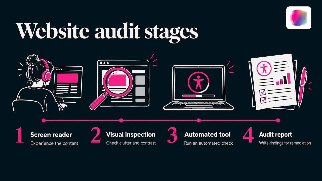
The Centre for Accessibility Australia describes a practical website audit in four stages: experience the content with a screen reader, inspect it visually for clutter and contrast, run an automated tool, and write an audit report for remediation. For documents, use the built-in accessibility checker in your software and confirm alt text and heading structure.
Our website accessibility audit checklist turns these stages into a working list for Australian organisations.
Test with dyslexic readers
Vision Australia advises testing typography with people with diverse disabilities rather than treating one fixed prescription as suitable for everyone. A simple, respectful approach:
- Recruit a handful of dyslexic readers, and pay them for their time.
- Give them real tasks, such as finding an opening time, completing a form or reading a short article, rather than asking them to rate the design.
- Compare two versions of the same page, changing one thing at a time, such as font, spacing or background colour.
- Ask what slowed them down and what they would change, then watch where they pause or re-read.
- Offer adjustable options where you can, such as text size controls or a plain-text version.
Putting it into your brand system
Dyslexia-friendly choices work best when they are decided once, in your brand guidelines, rather than argued over on every project. That means a primary body typeface with a stated minimum size and line spacing, approved colour pairs with their contrast ratios, rules for headings and emphasis, and a template for accessible documents.
A brand can still be distinctive within these limits. Keep personality in your logo, illustration, photography, colour palette and tone, and let body text be quiet and readable. Our guides to nonprofit brand guidelines and the visual identity system show how to document those rules so volunteers, staff and suppliers apply them consistently.
Our perspective
We see the same pattern again and again in the disability sector. An organisation commits to accessibility, then publishes a brand that treats it as a compliance box: generic imagery, a default font and a PDF nobody can easily read. The result looks like every other disability brand, and it does not serve its own audience.
Our view is that accessibility and strong branding are the same job. When the people designing your identity include young creatives with disabilities, as our team does, readability stops being a late audit and becomes a design decision from the first sketch. You choose the typeface because it reads well and fits your character. You set the spacing because you have felt what happens when it is wrong.
Dyslexia-friendly design is not a restriction on creativity. It is a brief, and good brands thrive on a clear brief. Our work is to make sure the result is unmistakably yours and easy for everyone to read.
Tommy
Work with a team that designs for access
If you want a brand, website and content that look distinctive and read clearly, we can help. DISBRANDED is a creative agency for disability organisations, social enterprises, startups and established businesses, with a team that includes people with lived experience of disability. Our services cover brand strategy, visual identity, graphic design, web design, content creation, social media management and brand-building courses. See our services for the full list.
If you are starting from scratch, our brand launch checklist maps the steps from strategy to launch day, and you can reach us through the DISBRANDED home page.
FAQ
What is the best dyslexia-friendly font?
There is no single best font. Australian guidance points to clear sans-serif options such as Arial, Atkinson Hyperlegible, Lexend, Open Sans and Source Sans, with distinct shapes for similar characters. OpenDyslexic and Dyslexie suit some readers, so treat them as options to offer or trial rather than a requirement.
What font size and spacing should I use?
For print, use at least 12 points, and 14 points where older or low-vision readers are likely. On screen, 16 pixels is the minimum and 18 pixels is better for longer reading. Aim for about 1.5 line spacing and left-aligned text.
Is a dyslexia-friendly website the same as an accessible website?
Mostly, yes. The typography choices are specific to reading, but clear headings, consistent navigation, strong contrast and resizable text come from WCAG. Australian authorities recommend WCAG 2.2 at minimum Level AA, so meeting that standard is the practical route.
Should I use a coloured or cream background?
Some readers prefer one, but preferences vary. The firmer guidance is to use plain backgrounds without images or watermarks, meet a 4.5:1 contrast ratio for ordinary text, and offer choices where you can. Test with dyslexic readers before settling.
How do I test whether my design works for dyslexic readers?
Start with an automated check, then review with a keyboard, a screen reader and different devices. Then give dyslexic readers real tasks and watch where they slow down. Their feedback is more useful than any rating of how the design looks.
Sources
- Create accessible materials, print and digital documents (Disability Gateway)
- Easy Read (Australian Government Style Manual)
- How people read (Australian Government Style Manual)
- Creating an accessible document (NSW Department of Communities and Justice)
- NAVA Accessibility guidelines
- Dyslexia Style Guide 2023 (British Dyslexia Association)
- Typography in Inclusive Design Part 2 (Vision Australia)
- Preparation of written material (Australian Dyslexia Support Services)
- Font Choices (ta11y)
- Accessibility testing (Digital NSW)
- Standards and guidelines on digital accessibility (Australian Human Rights Commission)
- How do I check if my work is accessible? (Centre for Accessibility Australia)
- Dark mode feedback board: how to design and test one (Petĩra)