
A visual identity is finished when it is clear, consistent and usable by someone who was not in the design meeting. This checklist walks you through the checks in the order they matter: strategy first, then logo, colour, type and imagery, then accessibility, guidelines and ongoing review. Use it to brief a designer, audit an existing brand, or decide whether a rebrand is ready to launch.
TL;DR
- Settle audience, positioning and brand voice before anyone opens a design file. A logo cannot fix an unclear promise.
- Check every element in use: logo versions, colour values, type, imagery and icons, each with written rules.
- Test accessibility early. Contrast, alt text, plain language and legible type sizes belong in the identity, not in a late fix.
- Put it all in guidelines with downloadable assets so staff and suppliers apply the brand correctly the first time.
- Review on a schedule. An identity that nobody maintains drifts.
Table of Contents
- Start with strategy, not the logo
- Brand voice: the part of identity people forget
- The visual identity checklist
- Check distinctiveness and inclusion together
- Turn the identity into guidelines people will use
- Launch and rollout checks
- Keep the identity healthy
- Where we can help
- FAQ
- Sources
Start with strategy, not the logo
Most identity problems are strategy problems that show up as design problems. If the team cannot say in one sentence who the brand is for and why it is different, no palette will carry it.
See how a large Australian organisation handles it. The NSW Government’s design checklist says planning should begin by consulting the Brand Framework, Visual Identity System and associated guidelines before creative work starts. The principle scales down to any organisation: read your own rules and strategy first, then design.
Before design begins, tick off these items:
- Purpose and mission are written down in plain language. If you need help, our guide to writing a brand purpose statement covers it.
- Values describe behaviour, not adjectives. “We publish in plain language” is a value. “Innovative” is a wish.
- A specific audience is named. “Everyone” is not an audience. Split primary and secondary groups, such as members, funders, referrers and staff.
- Audience research has been done: interviews with real people, reviews, enquiry emails and the words they use to describe their problem.
- Competitors and look-alikes have been reviewed visually. In many sectors, including disability services, imagery drifts toward the same blue palettes, handshake photos and generic icons. Know what you must avoid.
- A positioning statement exists.
- A messaging framework turns positioning into a few proof-backed pillars. Our brand messaging framework guide shows how for disability brands.
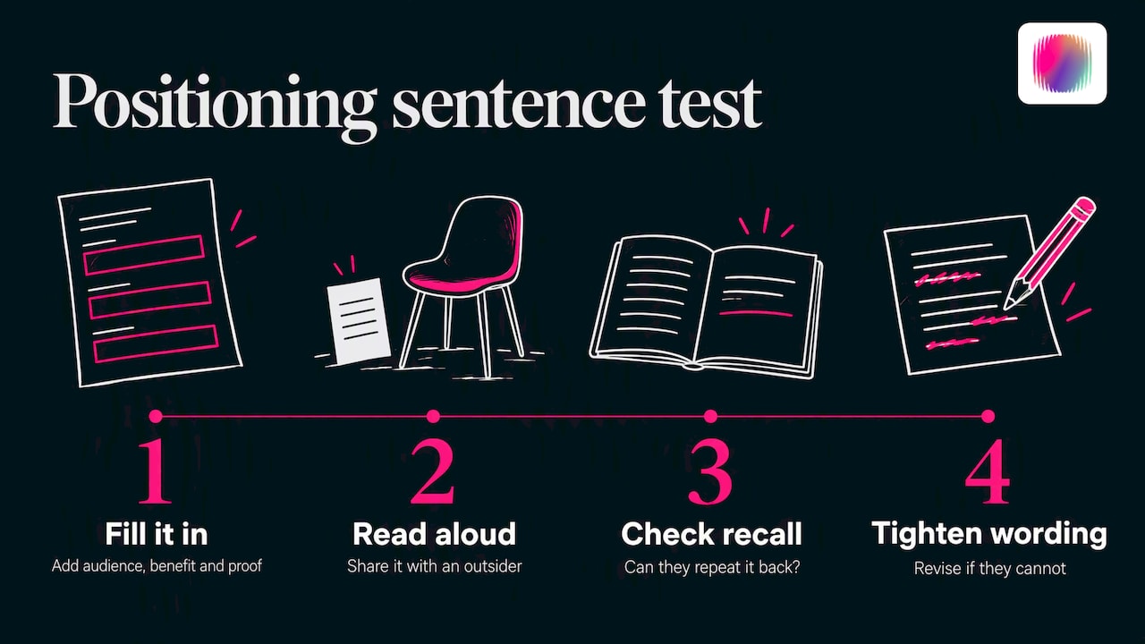
A positioning sentence you can test
A simple structure works: for [target audience], [brand] is the [category] that [differentiating benefit] because [reason to believe]. Fill it in, then read it aloud to someone outside the organisation. If they cannot repeat it back in their own words, tighten it.
The last clause matters most. A brand promise needs to be credible and deliverable, and it helps to check it with the people who would actually buy or refer. For product brands, testing your promise with real buyers is one way to find out whether the positioning holds up outside the room where it was written.
Brand voice: the part of identity people forget
Visual identity and voice should feel like one person. A warm, direct brand with a cold, corporate tone of writing sends mixed signals, however good the logo is.
Check that you have:
- Three to five personality attributes, each with a “this, not that” example.
- Preferred terminology, including how you refer to the people you serve. In the disability sector this is not cosmetic. Decide on language with lived-experience input and record it.
- Messaging pillars that every piece of content ladders up to.
- Tone rules: tone is how the voice adapts to context, so a grant application, an Instagram caption and an apology email sound related but not identical.
Our brand voice guidelines guide walks through writing these down so that anyone on the team can use them.
The visual identity checklist
This is the core audit. Work through it element by element, and for each one ask two questions: is it good, and is the rule for using it written down?
For a deeper explanation of how the parts fit together, see our overview of the visual identity system. If you also need help connecting strategy to a build across web and print, a brand and website design team can be part of the delivery picture.
Logo
A logo is a system of versions, not a single file. Check:
- Primary, horizontal and compact versions exist, so the mark works on a letterhead, a website header and a social avatar.
- Light and dark (reversed) versions are defined, with a rule for when each is used.
- Minimum sizes are set for print and screen.
- Clear space is specified around the mark.
- Misuse examples are shown: stretching, recolouring, adding effects, placing on busy images.
- The logo has enough contrast against the backgrounds it will sit on. The NSW checklist asks for correct logo versions, minimum size, positioning, clear space and sufficient contrast, a good template for any brand.
- Files are supplied in the formats people need: vector for print, PNG and SVG for web.
- It reads at 32 pixels wide. If it turns to mush, simplify.
- It is distinctive. Put it beside five sector peers with the names covered. Could you tell yours apart?
Colour
- A primary palette, a secondary palette and neutrals are defined, with clear proportions.
- Every colour has values for each medium: RGB or HEX for screen, CMYK for print and a Pantone reference where spot colour is used.
- Approved text and background pairings are listed, with contrast ratios. Body text should meet WCAG 2.1 AA at minimum, and we suggest working to WCAG 2.2 since it is the current version. Our WCAG 2.2 checklist covers what to test.
- Colour is never the only carrier of meaning. Errors, links and chart categories need a second cue such as an icon, label or pattern.
- The palette has been viewed on a cheap monitor, a phone in sunlight and a printed proof.
Typography
- A body typeface and, optionally, a headline typeface are chosen.
- A type scale is set: sizes, weights and line spacing for headings, body, captions and buttons.
- Fonts are licensed for every use, including web, app and any commissioned print.
- Fallback fonts are specified for email and documents where your brand font will not load.
- Hierarchy is clear at a glance. The NSW checklist asks for clear hierarchy, minimal all-caps and sufficient colour contrast in type, and long stretches of capitals are indeed harder to read.
- Rendering has been checked on screen, not just in a PDF. Thin weights that look elegant in print can disappear on a low-resolution display.
- Body text sits at a legible size, and line length and spacing are set for comfortable reading.
Imagery, illustration and icons
- Photography guidance explains subject, framing, lighting and what to avoid, such as stock-photo clichés.
- Illustration and icon styles are consistent in stroke weight, corner style and level of detail.
- People are represented authentically and with diversity where appropriate, which is also in the NSW checklist. For disability brands, this means showing people as capable, specific and in charge of the story, ideally photographed or commissioned with the community.
- Every photo carries alt text. Write it as a description of what matters, not a keyword list.
- Usage rights for photos and video are documented, including expiry dates, so an image does not become a liability in two years.
- Charts and infographics follow rules too. See our guide to accessible infographics.
Layout, motion and applications
- Grid, spacing and alignment rules exist for common formats: documents, slides, social posts, email and web pages.
- Motion rules are set if you use animation, including reduced-motion alternatives.
- Templates exist for the things people make most often: presentations, letterheads, reports, social posts, signature blocks.
- Signage, merchandise and event material have been tested, not just digital.
Check distinctiveness and inclusion together
Distinctive and accessible are not opposing goals. Constraints such as contrast and legibility often produce bolder, cleaner work than a muddy palette ever could.
Run these checks:
- The cover-the-logo test. Remove the name from a page or post. Is it still recognisably yours through colour, type, imagery and tone?
- The sector test. Line up your brand with similar organisations. Where do you blend in?
- The contrast test. Check text and interface colours against WCAG AA. The NSW checklist requires digital content to be checked against WCAG AA, and it is a sensible standard for any Australian organisation.
- The clear-language test. Is copy short, direct and free of jargon?
- The sensory test. Are there flashing elements, dense patterns or visual noise that could overwhelm some audiences? Our neuroinclusive design guide goes deeper.
- The lived-experience test. Have people from the community you serve reviewed the identity, and were they paid for their time?
Also run a basic legal check. Make sure logos, fonts, photos and any music are properly licensed, and that claims in your messaging can be backed up under Australian Consumer Law.
Our view: identity is a promise you keep in public
We have spent over 20 years watching disability brands settle for the same borrowed look: soft blues, stock images and slogans that could belong to anyone. Our view is that this is not a design failure, it is a representation failure. When the people shaping the identity have never lived the experience it describes, the result drifts toward the generic.
That is why our team includes young creatives with disabilities, and why we start every project with strategy rather than a logo. Distinctiveness comes from knowing precisely who you serve and what you stand for. Accessibility then becomes part of the look, not an afterthought bolted on at the end.
A checklist like this one is a useful guard against mistakes. But the brands that stand out are the ones that go further and build an identity with the community they represent.
Tommy
Turn the identity into guidelines people will use
A beautiful identity nobody can apply correctly is a short-lived one. Guidelines are where consistency is won or lost.
Good guidelines summarise purpose, audience and positioning, then give voice and terminology examples, logo rules, colour values and contrast guidance, typography, imagery and icon use. They also provide downloadable assets and templates, so people never have to recreate a logo from a screenshot.
For trade marks, IP Australia advises consistent use of the same spelling, layout, colours and positioning across public touchpoints, supported by basic rules for colour, fonts, size and placement. It also recommends routine checks, dated examples of use, and review processes for staff and any authorised external users such as suppliers.
Translate that into a guidelines checklist:
- One-page summary of purpose, audience, positioning and voice.
- Logo rules, with do and don’t examples.
- Colour and typography specifications.
- Imagery, icon and chart guidance.
- Accessibility standards you commit to.
- Ready-to-use templates and an asset library.
- An owner: one named person who answers questions and approves exceptions.
- A contact path for external designers and printers.
- A version number and date on the document.
If you run a charity or nonprofit, our guide to nonprofit brand guidelines lists what to include and how to get volunteers and partners to use them.
Launch and rollout checks
The weakest moment for any identity is the first three months, when old and new versions overlap. Before you go live:
- Inventory every place the old identity appears: website, email signatures, social profiles, forms, invoices, signage, vehicles, grant templates and third-party listings.
- Decide what is replaced on launch day and what is phased out.
- Brief staff, board members and key partners before the public sees it.
- Update directories and listings where your logo or description appears.
- Check that trade mark and domain details match your new presentation.
Our brand launch checklist takes you from strategy to launch day in Australia, and the rebrand rollout plan helps you close the gaps that appear after launch.
Keep the identity healthy
Identity maintenance is dull and valuable. Build it into the calendar:
- Quarterly: sample recent outputs (social posts, PDFs, emails) and compare them to the guidelines. Keep dated examples of correct use.
- Every six months: confirm everyone is using the latest logo version. The NSW checklist makes this an explicit item, alongside reviewing accessibility requirements and obtaining appropriate usage rights for photography and video.
- Annually: review the whole identity. Does it still reflect your audience, services and positioning? Have accessibility expectations moved? Are templates still being used?
- When staff change: onboard new team members and agencies with the guidelines.
- When something keeps going wrong: fix the guideline, not just the file. If people keep stretching the logo, add a clearer rule and a better template.
Where we can help
If this checklist shows gaps, we can close them. DISBRANDED is a creative agency that works with disability organisations, social enterprises, startups and established businesses on brand strategy, visual identity, graphic design, web design, content creation and social media management. Our team has lived disability experience, which shapes how we approach representation and accessibility from the first workshop. We also offer brand-building courses for teams who want to do more in-house.
See what we do on our services page, or browse our brand guides to start with a self-guided approach.
FAQ
What should a visual identity checklist include?
It should cover strategy (audience, positioning, voice), then the visual elements: logo versions, colour, typography, imagery and icons. Add accessibility checks, written guidelines with templates, and a review schedule. A checklist that stops at the logo leaves the hardest part, consistent use, to chance.
What is the difference between a brand identity checklist and a visual identity checklist?
Brand identity is the wider system: purpose, positioning, voice and behaviour as well as the look. Visual identity is the part people see, such as logo, colour, type and imagery. Treat the visual checklist as one section of the brand checklist, because the look should express the strategy.
How accessible does a visual identity need to be?
At a minimum, check text and interface colours against WCAG AA, add alt text to images, write in clear language and keep type at a legible size. Government bodies such as NSW already require WCAG AA for digital content, and it is a sensible benchmark for any Australian organisation. Our WCAG 2.2 checklist lists the specific tests.
How often should we review our visual identity?
Sample real outputs every quarter, confirm the latest logo version is in use every six months, and do a full review each year. Review sooner after a change in services, audience or leadership, or when accessibility standards change.
Do we need a designer to use this checklist?
No. Anyone can run the strategy, accessibility and consistency checks. A designer helps most with the logo system, type scale and imagery style, where small decisions change how the whole brand feels.
Sources
- NSW Government Visual Identity System: Design Checklist (June 2025)
- Use your trade mark prominently to build recognition and protection (IP Australia)