
Social media accessibility means publishing posts that people with disability can perceive, understand and engage with: images described in alt text, videos captioned, hashtags written so screen readers can read them, and text with enough contrast to see. It is mostly a set of habits applied to every post, not a one-off project. This guide gives you those habits, a checklist you can paste into your workflow, and the Instagram specifics, with Australian government guidance behind each point.
TL;DR
- Add alt text to every meaningful image, describing what matters and leaving out “image of”.
- Caption every video, and edit auto-generated captions before you publish.
- Write hashtags in title case, put them and @mentions at the end of the post, and use emojis sparingly.
- Use plain English, strong colour contrast (4.5:1 minimum for text) and never rely on colour alone to carry meaning.
- Turn the habits into a pre-publish checklist so accessibility is part of the process, not a fix afterwards.
Table of Contents
- What social media accessibility means and why it matters
- A social media accessibility checklist you can use today
- Alt text: describe what matters
- Video: captions, audio description and transcripts
- Hashtags, emojis, links and copy
- Colour, text on images and flashing content
- Accessibility on Instagram
- Our perspective
- Build accessibility into your workflow
- Common mistakes to avoid
- Work with a team that builds access into the brand
- FAQ
- Sources
What social media accessibility means and why it matters
NSW Government guidance says the images, videos, text and links you publish should be accessible so that everyone, including people with disability, can access information with ease. That covers people who are blind or have low vision, people who are Deaf or hard of hearing, people with cognitive or learning disability, and people sensitive to flashing content.
For an organisation, there are two reasons to care. The first is simple: if a post cannot be read, heard or understood, part of your audience is shut out of your message. The second is that exclusion is quiet. People rarely complain about a post they could not access. They scroll past, and you never find out. For a disability organisation, a social enterprise or any brand that speaks about inclusion, an inaccessible feed also undercuts the message itself.
The good news is that most fixes take seconds once they are routine. The sections below go through them in the order you meet them when building a post.
A social media accessibility checklist you can use today
Here is the short version. The detail behind each line follows.
| Element | What to do | Why it helps |
|---|---|---|
| Images | Add alt text describing the key information | Screen reader users get the content of the image |
| Decorative images | Leave alt text empty where the platform allows | Screen readers skip clutter |
| Video | Add captions, edit auto-captions, consider audio description and a transcript | Deaf and hard of hearing viewers, and anyone watching on mute |
| Hashtags | Title case, at the end of the post | Screen readers can separate the words |
| Emojis | Few, at the end of a sentence | They are read aloud in full |
| Text copy | Plain English, short sentences | Easier for everyone to follow |
| Colour | 4.5:1 contrast minimum for text, never colour alone | Readable for low vision and colour blindness |
| Text on images | Keep it short, large and high contrast | Image text is not read by screen readers unless repeated elsewhere |
| Motion | Avoid heavy flashing | Photosensitivity seizures |
Alt text: describe what matters
Alt text is a written description attached to an image. Digital NSW explains that it helps people using screen readers understand an image, and gives context if the image does not load. The same guidance says alt text should communicate the meaning of the image, and that purely decorative images should have empty alt text (alt=“”) where that is possible.
Four working rules:
- Describe the information, not every detail. Vision Australia’s guidance is to describe the most important and informational elements rather than decorative ones.
- Skip “image of” and “photo of”. The same guidance notes screen readers already announce that it is an image.
- Repeat any text in the image. If a quote card says “Applications close soon”, the alt text should carry those words too.
- Write for the purpose of the post. A photo of your team at an event might need “Four staff in branded shirts hold a banner at the community expo” in a recap post, but only the speaker and topic in a post announcing a talk.
A weak alt text: “Image of people.” A stronger one: “Two young designers review a brand colour palette on a laptop in a bright studio.” Neither is long. The second tells someone who cannot see the picture what the post is showing.
NSW Government guidance also flags that alt text cannot be added to GIFs on some platforms. When that is the case, put the meaning of the GIF in the post copy.
Video: captions, audio description and transcripts
Video is where many feeds fail. Three layers matter.
Captions. NSW Government guidance distinguishes captions, which show both words and sounds, from subtitles, which show only spoken words. Aim for captions where you can. The same guidance says to review auto-generated captions and correct them for accuracy. Auto-captions routinely mangle names, acronyms and sector terms, which are exactly the words your audience cares about.
Audio description. VisAbility’s Accessible Social Media Checklist recommends captions that include dialogue, sound effects and music, audio description for important visual content, and a transcript of the captions and audio description. If the key information in your video is only visible (a product demo, a chart, on-screen text), describe it aloud in the narration instead of saying “as you can see here”.
Transcripts. A transcript can live in a linked page or the post itself where length allows. It also helps anyone who prefers reading to watching.
A practical production habit: script videos so the speaker says what is on screen, then captioning and description come almost for free.
Hashtags, emojis, links and copy
Screen readers read what is written. Posts need to be written to be read aloud.
- Hashtags in title case. NSW Government guidance says to use title case (camel case) for hashtags so screen readers can distinguish the individual words, and to put hashtags and @mentions at the end of the post where possible. #InclusiveBranding reads as two words. #inclusivebranding reads as a jumble. Mass.gov’s testing checklist includes the same check for multi-word hashtags.
- Emojis sparingly. VisAbility notes that emojis are read aloud by screen readers, so a string of them becomes a string of descriptions. Put any emoji at the end of a sentence, and never use one in place of a word.
- Plain English. The NSW guidance advises plain English with a reading age of about nine. That does not mean talking down to people. It means short sentences, common words, one idea per paragraph, and explaining jargon or acronyms the first time.
- Links. Use link text or surrounding words that tell people where the link goes, and avoid stacking several links in one post.
- Line breaks and formatting. Break long posts into short paragraphs. Avoid decorative Unicode fonts and symbols, which screen readers may read as strings of unrelated characters.
If you want a refresher on writing so the message survives any format, our brand messaging framework guide helps you settle the plain core of what you say before you adapt it for each platform.
Colour, text on images and flashing content
Visual posts carry most of the risk, because the design is the message.
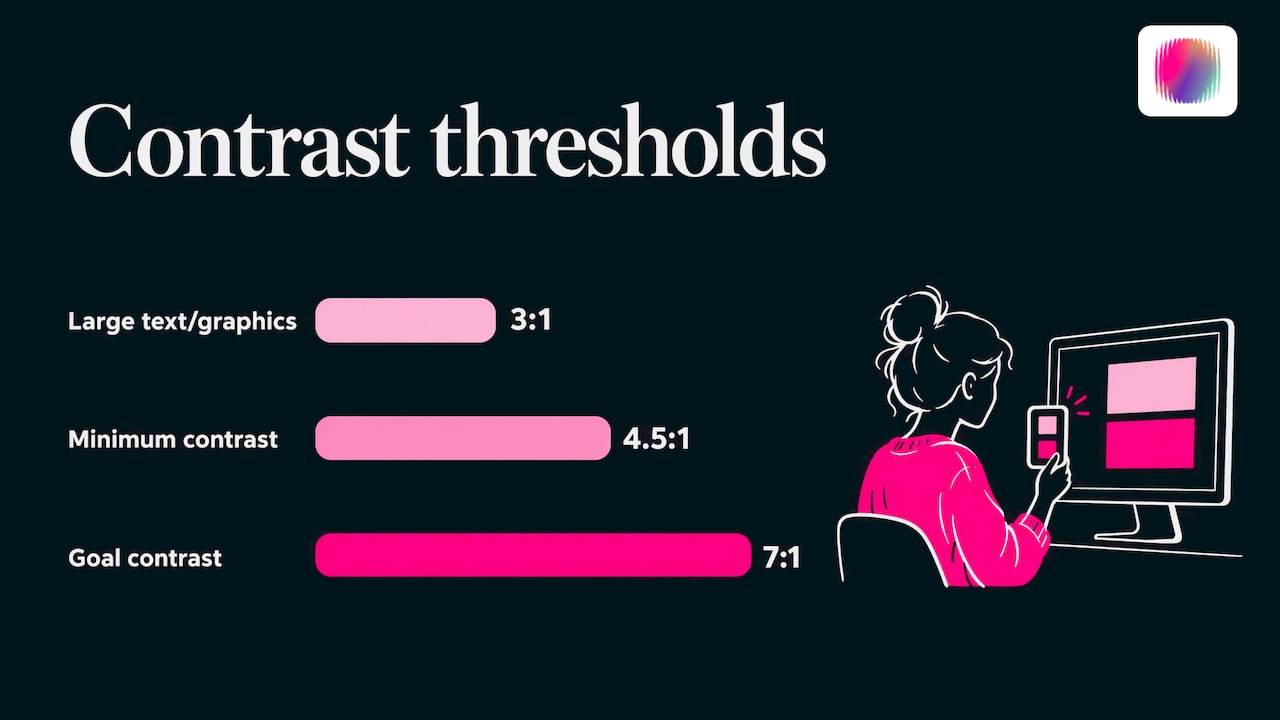
Contrast. NSW Government guidance calls for strong contrast between foreground and background, with a minimum ratio of 4.5:1 and a goal of 7:1. Mass.gov’s checklist adds that large text and graphics can meet a lower 3:1 threshold. Light grey on white and pastel text over photos are the usual offenders. Test your brand palette pairs once with a contrast checker, then record the safe pairings in your brand guidelines so no one has to guess.
Colour is never the only signal. A red and green chart, or a post that says “tap the blue button”, leaves some people behind. Add labels, patterns or words.
Text on images. Digital NSW advises avoiding posting or resharing images or video with excessive text. If you do use text, make the font large, readable and high contrast, and put the same information in the caption or alt text so it is not locked inside a picture.
Flashing content. NSW guidance advises against posting overly flashing content that could trigger photosensitivity seizures. Check fast cuts, strobe effects and animated overlays before you export.
Infographics are the format most likely to break all of these rules at once. Our guide to accessible infographics walks through fixing that, and our visual identity checklist helps you build contrast and legibility into the brand itself.
Accessibility on Instagram
Instagram is image-led, so alt text matters most there. Vision Australia notes that alt text is particularly important on image-focused platforms such as Instagram, because it lets screen reader users reach the information in your images.
A workable approach for posts, Stories and Reels:
- Feed posts and carousels. Write alt text for each image where the platform offers the field, and put the key message in the caption too. For carousels, make sure the caption makes sense without seeing every slide.
- Stories. Stories disappear quickly, so keep on-screen text short, large and high contrast, and avoid placing text where interface elements will cover it. If a Story carries important information, say it in the audio or repeat it in a longer post.
- Reels. Caption the audio, check auto-generated captions for errors, and describe key visuals in the voice-over.
- Captions and hashtags. Title case, at the end, with emojis kept to a minimum.
Platform tools change often, so check each platform’s own help pages for where its alt text and caption settings currently sit. Guide Dogs NSW/ACT makes the same point: accessibility depends on applying guidance for each platform. For a fuller Instagram plan, see our guide to Instagram for nonprofits.
Our perspective
Most organisations treat accessibility as a layer added after the design is done. We think that is backwards, and it is why so many feeds feel generic. When a brand is built with access in mind from the start, it tends to be clearer, more distinctive and easier to run.
Our team includes young creatives with lived experience of disability. That shapes how we work: we ask who can actually use a post before we ask how it looks. Strong contrast, plain language and well-written captions are not constraints on creativity. They are part of what makes a brand voice recognisable and trusted.
For disability organisations in particular, the feed is often the first place someone decides whether you understand them. Generic stock imagery and vague messaging say you do not. Accessible, specific, human content says you do. That is the work we do with clients: brand strategy, visual identity and social media that are designed to be both distinctive and usable.
Tommy
Build accessibility into your workflow
A checklist only works if it sits where the work happens. Here is a simple way to set it up.
- Put the checks in the brief. Every post request includes fields for alt text, captions and hashtag formatting, so it is written alongside the copy, not squeezed in at publishing.
- Set brand rules once. Record approved colour pairings, minimum text sizes, caption style and hashtag format in your nonprofit brand guidelines. Designers then start from safe defaults.
- Add a pre-publish check. Mass.gov’s testing checklist is a useful model: confirm images have meaningful alt text, contrast meets the ratios, colour is not the only carrier of meaning and hashtags are in camel case. A second person checking for two minutes catches most misses.
- Review captions every time. Auto-generated captions are a first draft.
- Audit a sample monthly. Pull ten recent posts, run the checklist, and note the most common miss. Fix that habit first.
- Extend to your website. Social posts often link to web pages, so the experience should hold up end to end. Our WCAG 2.2 checklist and guide to writing an accessibility statement cover that side.
If you are planning the wider programme, our guide to social media for nonprofits covers strategy, content planning and measurement, and our neuroinclusive design guide helps with cognitive accessibility, including pace, clutter and predictability.
Common mistakes to avoid
- Writing alt text as an afterthought. “Photo” or a filename helps no one.
- Trusting auto-captions. Names, acronyms and sector terms are the first things to go wrong.
- Hashtags in lowercase. One pass in title case fixes it.
- Stacking emojis as bullets. Each one is read aloud.
- Text-heavy graphics with no caption. The information is locked in the image.
- Colour-only meaning. Pair colour with words or shapes.
- Resharing inaccessible content. The guidance on text-heavy images applies to what you reshare, not only what you create.
Work with a team that builds access into the brand
If your feed needs more than a checklist, we can help. We work with disability organisations, social enterprises, startups and established businesses on brand strategy, visual identity, content and social media, and our team brings lived experience of disability to the work. We also run DIY courses for teams who want to build the skills in-house. See what we offer on our services page.
If you are weighing up outsourcing, our guide to social media management costs in Australia sets out what to expect.
FAQ
What is the first thing to fix for social media accessibility?
Start with alt text on images and captions on video, because those two gaps shut out the most people. Then fix hashtags (title case) and contrast. Once those are routine, add transcripts and audio description for important video.
Do I need to caption every video?
Yes, aim to. NSW Government guidance says to include captions where possible and to review auto-generated ones for accuracy. Captions that show sounds as well as words serve Deaf and hard of hearing viewers, and they also help anyone watching without sound.
How long should alt text be?
Long enough to carry the key information and no longer. Describe the most important elements, repeat any text in the image, and skip “image of”. If an image is purely decorative, leave the alt text empty where the platform allows.
Why do hashtags need capital letters?
Screen readers cannot always tell where one word ends and the next begins in an all-lowercase hashtag. Capitalising each word, as in #AccessibleDesign, lets them read it correctly. Place hashtags at the end of the post so they do not interrupt the message.
Is there an official Australian guide I can follow?
NSW Government publishes social media accessibility guidance covering images, video, text, colour and hashtags, and Digital NSW has a companion toolkit. Both are written for government communicators, but the practices apply to any Australian organisation.
Sources
- Accessibility and inclusion on social media, NSW Government
- Social media, Digital NSW accessibility and inclusivity toolkit
- Accessible Social Media Checklist, VisAbility
- How to make social media accessible: our top three tips, Vision Australia
- Social Media Post Accessibility Testing Checklist, Mass.gov
- Social media accessibility, Guide Dogs NSW/ACT