
A colour-blind friendly palette is one where meaning never depends on hue alone. It uses strong contrast between light and dark values, avoids the pairings that blur together (red with green above all), and backs every colour up with a label, icon, pattern or shape. You can do all of this and still have a distinctive brand. This guide shows how, with examples from Australian government design systems, the contrast numbers to hit and the tools to test with.
TL;DR
- Contrast and lightness do more work than hue. Choose colours that differ in light and dark, not only in colour.
- Avoid red with green, red/orange/brown/green sets, pink with turquoise and grey, and purple with blue as the only way to tell things apart.
- Aim for WCAG AA: 4.5:1 for normal text and 3:1 for large text, and add symbols, labels or patterns wherever colour carries meaning.
- Test your palette with contrast checkers and a colour-vision simulator, then with real people.
- Treat accessible colours as brand tokens: define them once, in your guidelines, and reuse them everywhere.
Table of Contents
- What makes a palette colour-blind friendly
- Colours and combinations that cause trouble
- Palette examples you can learn from
- Contrast ratios your palette needs to meet
- Never let colour carry the message alone
- Turn accessible colour into brand rules
- How to test your palette
- A quick process for building your palette
- Our perspective
- Get a palette that is accessible and unmistakably yours
- FAQ
- Sources
What makes a palette colour-blind friendly
Nobody can make a palette that looks identical to every viewer, so the goal is a design that works whichever way someone sees it. Digital NSW describes a colour-blind friendly design as one with strong contrast that does not rely on colour alone, using labels, patterns, clear structure, borders, typography, placement or icons as other cues. Its guide asks designers to think about protanopia, deuteranopia, tritanopia, monochromacy and achromatopsia.
In plain terms, those cover the main ways colour perception differs:
- Protanopia and deuteranopia: reds and greens are hard to separate. This is the red-green group, and the one most palettes trip over.
- Tritanopia: blues and yellows are harder to tell apart.
- Monochromacy and achromatopsia: colour is seen very little or not at all, so the design has to read in greyscale.
That last point is useful for every designer. If your palette survives being converted to greyscale, it will survive most forms of colour-vision difference. The ACM’s publishing guidance makes the same case: it recommends that work stays readable in greyscale because red-green deficiency is common, blue-yellow deficiencies can be acquired, printing may be black and white, and situations such as glare can reduce colour discrimination. So a colour-blind safe palette also helps the person reading your flyer on a cheap office printer or your site on a phone in sunlight.
Colours and combinations that cause trouble
The European Commission’s data-visualisation guide flags red-green weakness as common and warns against sets built on red, orange, brown and green. It also names pink-turquoise-grey and purple-blue as problem combinations. Safer options it points to include blue alone, blue with orange or red, and colours that vary in lightness.
The pattern behind this advice is worth remembering:
| Risky pairing | Why it fails | Safer move |
|---|---|---|
| Red and green | Look alike to people with red-green deficiency | Blue and orange, or a dark and a light version of one hue |
| Red, orange, brown, green together | The whole set can merge | Fewer hues, clear lightness steps |
| Pink, turquoise and grey | Can collapse into similar tones | Separate by lightness and add labels |
| Purple and blue | Can be hard to separate | Change lightness strongly or use another hue pair |
A common brand mistake is using red for “error” and green for “success” in a form or dashboard with nothing else to signal the state. The fix is not to ban red and green. It is to add an icon, a word or a border so the colour is a bonus rather than the message.
Palette examples you can learn from
Australian government teams publish palettes that have been checked for contrast, and they show how restrained, recognisable colour can still carry an identity. The Australian Treasury’s brand guidelines give example combinations labelled WCAG 2.0 AA:
| Background | Colours that work on it | Hex codes |
|---|---|---|
| White or light grey | Navy, green, mid-blue | #2C384A, #4D7861, #5D779D |
| Navy or black | Lime, light blue, orange | #B1F0CF, #90B6F0, #F0AE81 |
These are Treasury’s own accessible combinations. Notice what they do. Each set uses a mix of dark, mid and light values, so the colours differ in brightness as well as hue. Flip the background from light to dark and the palette changes with it, instead of one set being forced to work everywhere. That “light-mode set and dark-mode set” habit is a useful thing to copy in your own guidelines.
These hex codes are a starting point for study, not a recipe to paste into your brand. Your organisation’s colours should come from who you are and who you serve. The lesson is the structure: a few anchored colours, with clear rules about which sit on which backgrounds.
Starting a palette from a tested scheme
If you need colours for charts or maps, ColorBrewer is the standard starting point. The Netherlands Cancer Institute’s guidance walks through it: select the number of classes you need, choose qualitative, sequential or diverging data, and turn on the “colorblind safe” option. It lists maximums of 4 colours for qualitative, 9 for sequential and 11 for diverging schemes. If you need more categories than that, the answer is usually to group, label directly or split the chart, not to squeeze in more hues.
The ACM also recommends ColorBrewer, along with the ACE tool, for choosing colours with enough black-and-white variation. For infographic work in particular, our guide to accessible infographics goes further into layout, alt text and data labelling.
Contrast ratios your palette needs to meet
Colour-blind safety and contrast are related but not the same thing. A palette can have high contrast and still rely on a red-green distinction, and a palette can avoid red-green and still have text that is too faint. You need both.
Victoria’s digital guide sets out the targets. WCAG AA requires a contrast ratio of 4.5:1 for normal text and 3:1 for large text, while AAA asks for 7:1 for normal text and 4.5:1 for large text. The same guide defines large text as 14 point and bold or larger, or 18 point or larger.
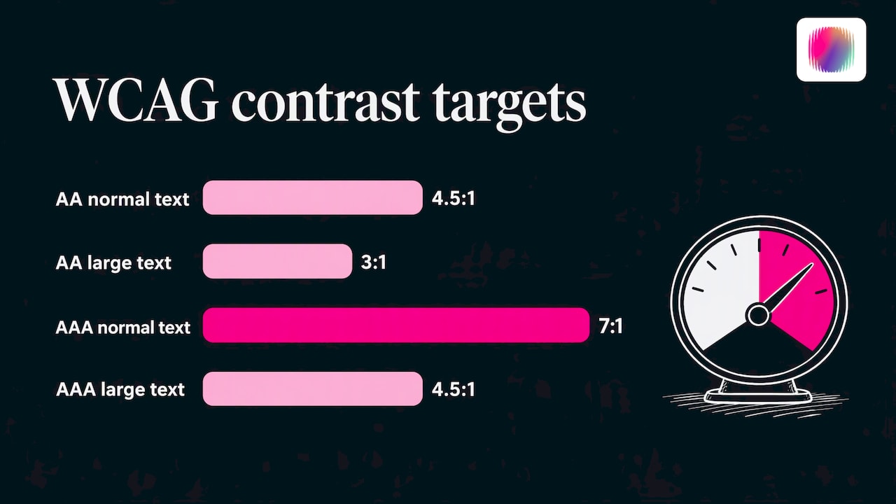
The South Australian Online Accessibility Toolkit adds a scope point: contrast requirements apply to text and graphics that are essential to understanding content or functionality, with exceptions for logo text, disabled controls and incidental graphics. That matters for brand teams. Your logo wordmark is exempt from the text rule, but your buttons, form borders, chart lines and icon-only controls are not.
A practical way to apply this:
- Set body text and its background at 4.5:1 or better. Make that your default pairing.
- Check every accent colour you use for headings, buttons and links against each background it will sit on.
- Check graphics that carry meaning, such as chart lines, status icons and input outlines, against the 3:1 level.
- Record the approved pairings in your guidelines so no one has to guess.
If you are working through the wider standard, our WCAG 2.2 checklist for Australian organisations covers the colour criteria alongside the rest.
Never let colour carry the message alone
The most reliable colour-blind design habit has nothing to do with choosing the right hex code. It is making sure that anything colour says is also said another way.
The Australian Government’s Disability Gateway states that colour-coded information must also be communicated with symbols, patterns and/or text, and recommends colour-blind-safe colours and online contrast checkers. Digital NSW gives concrete options: patterns or shapes, and for buttons and forms, borders, type weight or size, opacity, placement and icons. For charts, it recommends explicit segment labels and map legends or keys so nobody has to infer meaning from colour.
Here is how that looks in common brand materials:
- Website links: underline them. The Agriculture Design System says interactive components should not be identified by colour alone, and that links should also be underlined.
- Forms: pair a red error state with an icon and a short written message such as “Enter a valid email address”.
- Charts: label lines or bars directly. The Netherlands Cancer Institute recommends limiting categories, connecting labels directly to the data (or keeping legends in data order), and using patterns and shapes so figures work in colour and greyscale.
- Social graphics: if a post uses a colour-coded key, add the words on the graphic, not only in the caption.
- Printed material: check it in greyscale. If two categories merge, change their lightness or add a pattern.
There is a useful way of seeing this. The Disability Gateway treats colour accessibility as a matter of information design as much as palette choice: the same meaning has to be available through text, symbols or patterns. A brand that adopts that view stops asking “which colours are safe?” and starts asking “what is this colour for, and what else says it?”
Turn accessible colour into brand rules
A fear that comes up often is that accessible colour means a bland brand. The Australian public sector shows otherwise. Victoria’s Ripple design system says its tested colour pairings meet accessibility ratios, and it recommends teams recheck any changed brand colours against WCAG. Its approach lets teams keep their brand colours while defining tested interaction and neutral colours around them.
The Agriculture Design System takes the same idea further with reusable colour tokens and component rules: foreground and background tokens designed to meet WCAG 2.1 AA. Accessibility becomes a decision made once, not a debate on every screen.
For your own organisation, that translates into a short list of rules inside your brand guidelines:
- Core colours: two or three that carry the identity, each with its approved background pairings.
- Functional colours: success, warning, error and link states, each with an icon or text partner.
- Neutrals: a tested set of greys for text, borders and backgrounds.
- Data colours: a short, labelled series for charts, with patterns defined.
- Dark and light variants: the pairings that work on each.
If you do not yet have these documented, our guides to nonprofit brand guidelines and the components of a visual identity system show where colour rules sit alongside logo use, type and imagery.
How to test your palette
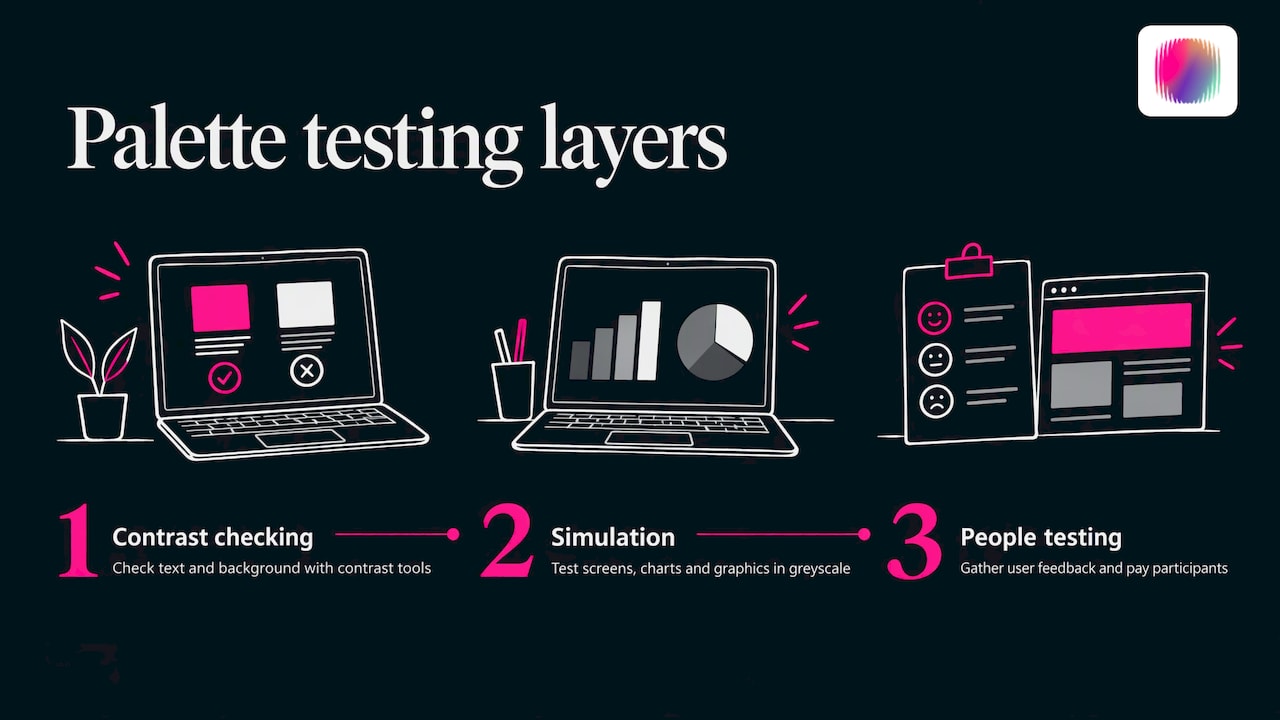
Testing has three layers: contrast, simulation and people.
Contrast checking. The South Australian toolkit recommends checking combinations with Snook, Contrast Grid and the Accessible Colour Palette Builder, and checking text and background contrast with WebAIM, Sketch or Vision Australia tools. Vision Australia’s resource lists the TPGi Colour Contrast Analyser, the WebAIM Contrast Checker, a Figma contrast plugin and the Adobe colour contrast analyser. Its own earlier analyser has been discontinued and superseded by the TPGi version, so use the current one.
Simulation. The same Vision Australia page lists Funkify for simulating colour-vision differences and other visual conditions. Run your key screens, charts and brand graphics through a simulator, and also view them in greyscale. Look for places where two meanings collapse into one.
People. Simulators are a guide, not a verdict. Digital NSW recommends usability testing with user feedback after accessibility checks, because automated or visual checks alone do not show whether a product works for real users. Build that into a launch plan, ideally with people who are colour blind or have other disabilities, and pay them for their time.
When you audit a whole site rather than a single palette, our website accessibility audit checklist gives you a structure to follow.
A quick process for building your palette
- Start with meaning. List what colour needs to communicate: brand recognition, status, categories, calls to action.
- Choose your hues. Pick colours that fit your brand personality, then favour blue-led or blue-and-orange schemes over red-green ones.
- Spread the lightness. Make sure your palette includes clearly dark, mid and light values.
- Pair and check. Test every foreground and background pairing against 4.5:1 for text and 3:1 for large text and meaningful graphics.
- Add second cues. Define icons, labels, patterns and underlines for every colour that carries meaning.
- Simulate and convert. View in greyscale and through a colour-vision simulator.
- Document. Record the pairings and rules in your brand guidelines.
- Test with people. Get feedback from real users before launch, and recheck whenever a colour changes.
Our perspective
Most colour-blind palette advice treats the problem as a list of banned colours. We see it differently. The problem is a brand asking colour to do a job that something else should share.
Our team includes young creatives with disabilities, and that shapes how we work. We do not bolt accessibility on after the logo is approved. We start with the question of who will meet the brand, and how, and let the palette grow from there. That way accessible colour is part of the identity, not a patch over it.
The disability sector has a particular reason to get this right. If an organisation that serves disabled people publishes a chart nobody with colour-vision difference can read, the brand says something it never meant to say. And the sector has long leaned on generic imagery and safe, forgettable colour. A palette built on strong lightness contrast, a few confident hues and clear second cues is not a compromise. It is often more distinctive than the default.
Our advice: document your colour pairings once, make them tokens in your guidelines, and give every colour a partner cue. Then your whole team can create with confidence.
Tommy
Get a palette that is accessible and unmistakably yours
If your organisation is rethinking its colours, we can help. DISBRANDED is a creative agency that works with disability organisations, social enterprises, startups and established businesses on brand strategy, visual identity, graphic and web design, content and social media. Our team has lived disability experience, and we build accessible colour into the identity from the first workshop.
See how we work on our brand and creative services page, or if you would rather build in-house, explore our DIY branding courses from the same page.
FAQ
What are the best colours for a colour-blind friendly palette?
There is no single best colour set, but blue is a dependable anchor, and blue paired with orange or red is a safer option than red with green. The key is to vary lightness so colours differ in brightness as well as hue. Checking your palette in greyscale is a quick way to confirm it.
Which colours should I avoid together?
Avoid relying on red and green to tell things apart, and be careful with sets of red, orange, brown and green. The European Commission’s guide also flags pink, turquoise and grey together, and purple with blue. You can still use these colours if each carries a label, icon or pattern as well.
What contrast ratio does my palette need in Australia?
The common target is WCAG AA: 4.5:1 for normal text and 3:1 for large text, according to Victoria’s digital guide. Large text is 14 point bold or larger, or 18 point or larger. Check text, and also graphics that are essential to understanding, such as chart lines and form outlines.
Can a colour-blind safe palette still look distinctive?
Yes. Government design systems keep a recognisable identity by fixing a small set of brand colours and defining tested pairings and neutrals around them. Strong lightness contrast, confident hues and clear second cues give a brand character without relying on risky combinations.
How do I test my colours for colour blindness?
Use a contrast checker such as the WebAIM Contrast Checker or the TPGi Colour Contrast Analyser, then run designs through a simulator like Funkify and view them in greyscale. Finish with usability testing involving real users, since tools alone cannot show whether a design works for people.
Sources
- A guide to digital accessibility for colour blind users, Digital NSW
- Accessible colour palettes, European Commission data visualisation guide
- Treasury Brand Guidelines, Australian Treasury
- Guidelines color blind friendly figures, Netherlands Cancer Institute
- ACM Accessibility Recommendations for Publishing in Color
- Create accessible materials, Disability Gateway
- Colour tokens, Agriculture Design System
- Online Accessibility Toolkit, Government of South Australia
- Typography and accessible colour digital guide, Victorian Government
- Colour accessibility tools and resources, Vision Australia
- Colour, Ripple design system, Victorian Government